When we think about landing pages, we think digital-first. Many of our clients at Rainmaker Digital Services are Internet natives with digital-first business models; it’s understandable.
But brick and mortar businesses use landing pages too. Here’s how you can use landing pages to turn brick and mortar customers into click and mortar revenue.
Why Landing Pages?
A landing page gets a prospect to take immediate action. All businesses use them, but there are important differences between digital and brick and mortar landing pages.
In the digital world, landing pages drive immediate action: download the eBook, get the email list confirmation, buy the product.
In the physical world, there’s an extra step needed for results: showing up physically. Prospects set an appointment, schedule a rental, make a contact, but they have to go to the place to take action. There’s no immediate gratification. That changes how you build the page.
Let’s take a look at some real-world examples of brick and mortar landing pages. You’ll notice these are all based in Oklahoma City. I wanted four or five examples of businesses doing this right and decided to constrain it to my area; it took me less than 20 minutes to gather all of these examples.
I could have chosen any city and done the same — it’s not that hard to find brick and mortar businesses that are thriving digitally. But it does have to be done right.
The Elements of a Click and Mortar Landing Page
There are three critical parts of any landing page; they’re the same for both digital and brick and mortar businesses, but the approach is different for each.
Headline
We’ve written about the four U’s of headlines before: useful, urgent, unique, and ultra-specific. Those apply to all landing pages. But for click and mortar, we change the emphasis.
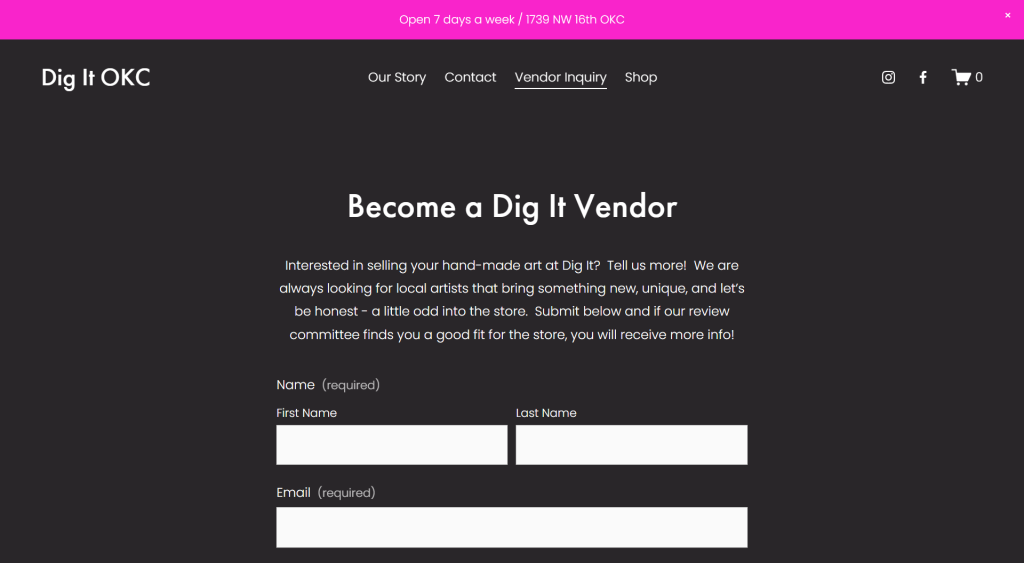
Take Dig It OKC as an example:
“Become a Dig It Vendor” isn’t going to win you any prizes at Cannes, but it’s useful and ultra-specific. We don’t have to worry about uniqueness or urgency as much here.
If it’s on brand, though, uniqueness is still effective. Experiential art museum Factory Obscura’s landing page for the “Mix-Tape” exhibit works because of this. It grabs attention, then uses the body copy to persuade.
Speaking of the copy …
Body
Landing page copy needs the ABCs: action, benefit and clarity. We covered those in more detail in our piece “The ABCs of Landing Pages.”
Many digital-first landing pages run long. You can’t get away with that for click and mortar businesses. The copy must be short, punchy and clear. Tell them what to do and get out of the way in one to two paragraphs. Your ultimate goal is not to convince them to click the CTA — your goal is to get them to show up in person. Don’t bore them. Motivate them.
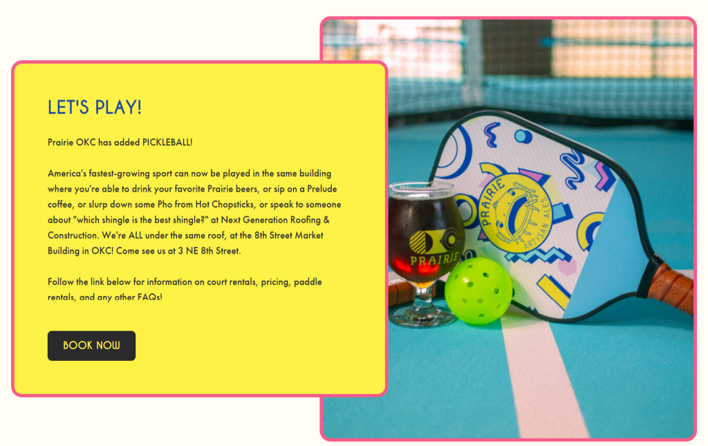
The Prairie Artisan Ales OKC taproom’s pickleball landing page is a great example:
They tell you up front the action they want you to take (play pickleball) and explain the benefits (all the food and drinks under the same roof). It’s clear, concise and effective.
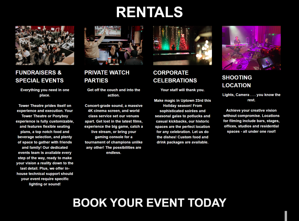
There are cases where photos may be important too; take Tower Theatre’s booking page:
I’m not in love with the spacing on the text, but it’s a good example of letting pictures do the work for you.
There’s more text here, but each section abides by our two-paragraph maximum rule. Think of this as four different landing pages; people who are trying to book the venue will immediately read whichever one matters to them and discard the others.
And speaking of action …
Call to Action (CTA)
No landing page is complete without telling the prospect what action to take next. We’ve seen several great examples of CTAs here — “Book Your Event Today” is excellent from Tower Theater, as is “Book Now” from Prairie. They’re simple, and they focus on immediate action. They’re also set off well from the rest of the page with contrast. For more on how to craft an effective CTA, you can check out our article “Sharpen Your Hook: Craft a Killer CTA.”
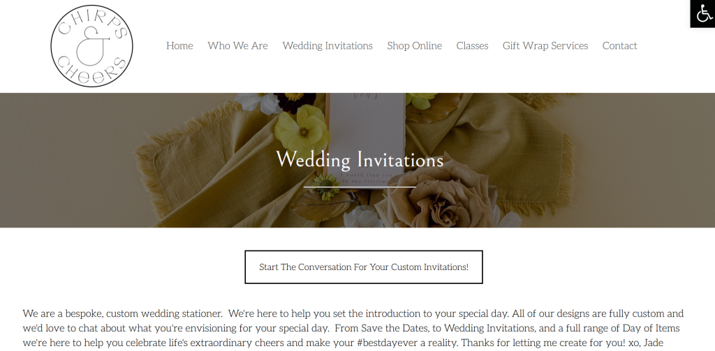
Usually your CTA will be after the body copy, but if your audience is already motivated, you might be able to get away with putting one before — like stationery store Chirps and Cheers does here:
I wouldn’t do this on most landing pages, but if you know your audience is already invested — wedding planners who know you already, anxious brides, etc. — this works. Again, with brick and mortar businesses, the faster you move through the conversation and get them to commit to showing up in person, the better.
Landing Pages Matter for Brick and Mortar Too
These are all successful, established businesses, and these pages are doing exactly what they need to do: get people to take action. They’re not all perfect — but they are real, and they work. You don’t have to be a full-time marketer to follow their example.
You probably think of landing pages as digital-first, but brick and mortar businesses need landing pages too. Turn brick and mortar to click and mortar by following these tips. And if you need a hand, we’d love to help — just drop us a line, anytime.
Best Regards,
David Brandon
Copywriter
Rainmaker Digital Services
