Greetings Rainmakers!
Welcome to this month’s State of the Platform. It’s been an eventful month at Rainmaker Digital Services; we have release notes and some tips on how to use the new and updated features on your site. Let’s dive in.
Release Notes
Since the last State of the Platform, we’ve upgraded Rainmaker Platform from 3.3.6.6 to a new numbered version (3.4), then added a couple of incremental revisions on top of that.
3.4 brought added security functionality, back-end core updates aimed at improving site speed and efficiency and more dynamic design features.
In revision 3.4.0.1, we added improvements to podcast feed generation.
And in revision 3.4.1, our current production code base, we’ve significantly upgraded content production functionality with enhancements to Beaver Builder, WooPack and PowerPack.
For a full list of improvements, fixes and changes, see the 3.4 changelog. You can also click through at the bottom of the screen to see the changes in the 3.3 edition.
Using Rainmaker Platform 3.4.1 to Create Better Pages
The upgrades in version 3.4.1 make it easy to create better pages for your website.
What do we mean by “better?”
Everything we do here at Rainmaker Digital Services is aimed at allowing you to build your business online. We want to make sure you can get the right message across in the right format at the right time to the right people. With 3.4.1, you can.
The new technologies allow for inline coding and give you the chance to make more dynamic page layouts, whether you’re comfortable with code or not. Here’s how to get started.
Turning On Features
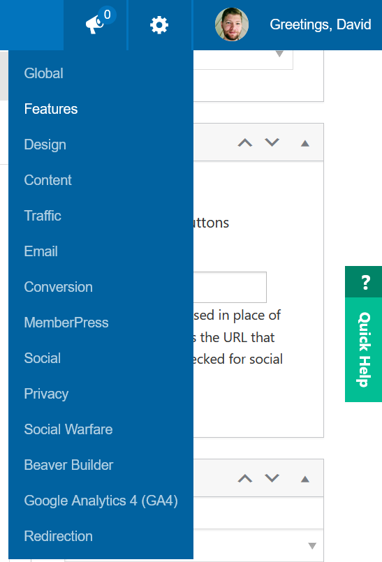
To check out the features that have been updated in 3.4.1, you’ll need to enable them on your site. Mouse over the top right Settings gear icon and click “Features.”
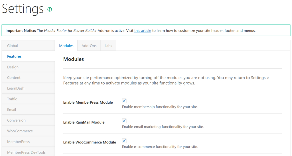
This will take you to the Modules page. If you want to use WooPack, make sure WooCommerce is turned on, then scroll down to the bottom of the page and click “Save.”
Now click the Add-Ons tab (it’s next to Modules in the top left-middle of the screen) and make sure Beaver Builder Plugin (standard version), WooPack for Beaver Builder and PowerPack for Beaver Builder are turned on, just like you did for Modules. You will only need WooPack if you’re using WooCommerce. Click Save at the bottom of the screen.
With these important Modules and Add-Ons turned on, you can start creating. We’ve done a couple of Beaver Builder tutorials before if you need a little help getting up to speed on the tool, but we’re going to assume that you’re at least familiar with the basics of the editor. Let’s take a look at three ways you can use these new tools in Rainmaker Platform version 3.4.1 to build better pages.
1: Better Product Pages
WooPack gives you tools to add several WooCommerce-specific design modules to your Beaver Builder pages. There are several major changes to WooPack in this version.
Create a new page using Beaver Builder (check our landing page video if you need help getting started).
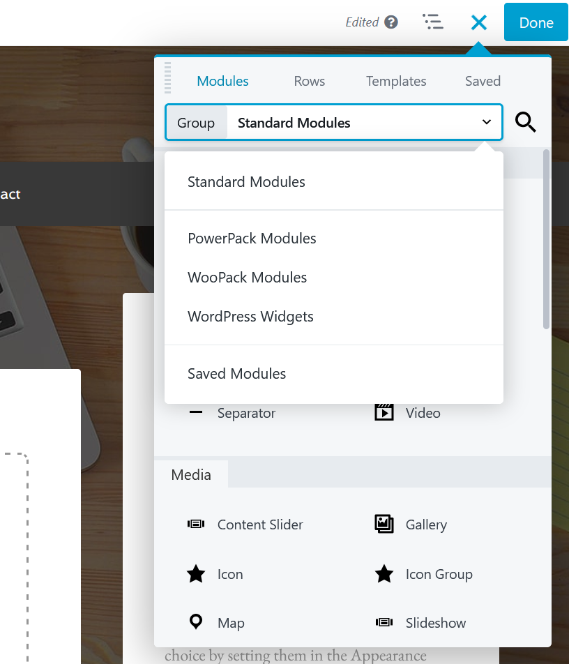
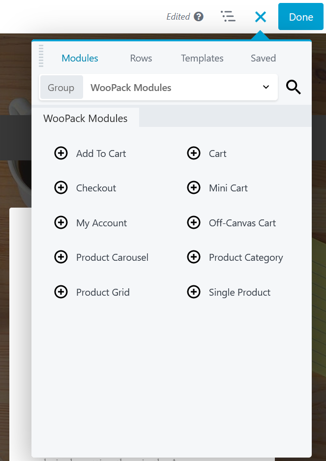
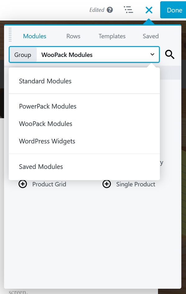
Then, from the Modules section of your design toolbox, click the drop-down box and choose “WooPack Modules.”
You’ll see a wide variety of WooCommerce modules that allow you to build a product page quickly and easily.
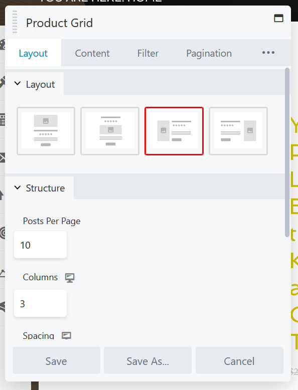
You can build a page for a single product pretty quickly with “Single Product,” “Add to Cart” and “Checkout and Cart.” But we’re focusing on a catalog page, which is best built with the product grid. Drag the “Product Grid” module to the page and the settings for the block will pop up.
From the Settings screen, you can adjust your layout, choose the types of products you want to display (including drilling down by category or by custom criteria) and more. Finally, click “Save.”
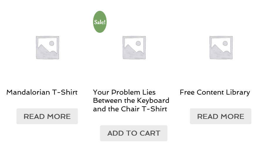
This grid is only one of the ways you can display a number of products on a page; the “Product Carousel” and “Product Category” modules let you display multiple products as well. But the grid allows for more customization, and in the latest update it added support for larger breakpoints.
The product grid isn’t only useful for pages that are meant to display a group or category of products. If you have a small enough product selection, you can use it as a related product recommendation on a single product page, like Amazon does.
2: Better Checkout Pages
The updated WooPack in Rainmaker Platform also includes support for an enhanced checkout experience.
WooPack has had a built-in checkout module for over two years. But it’s been fairly barebones. That’s changed with this new version.
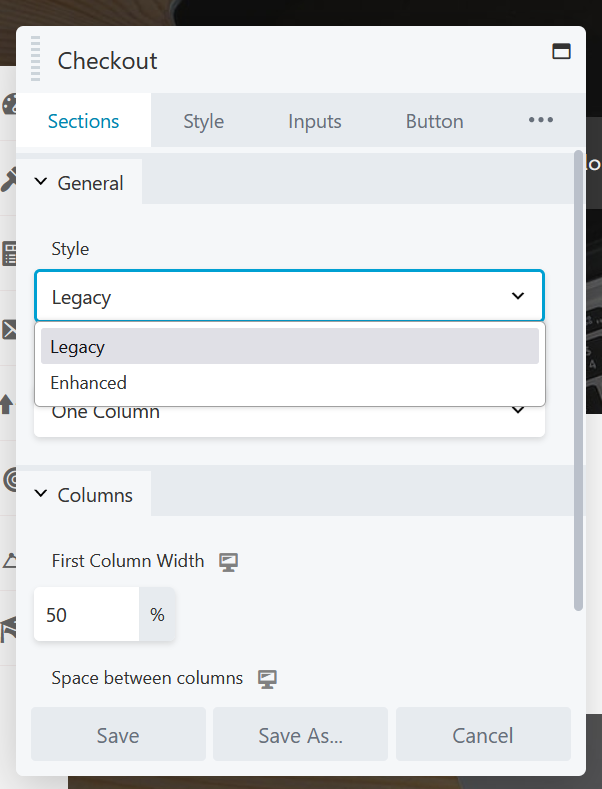
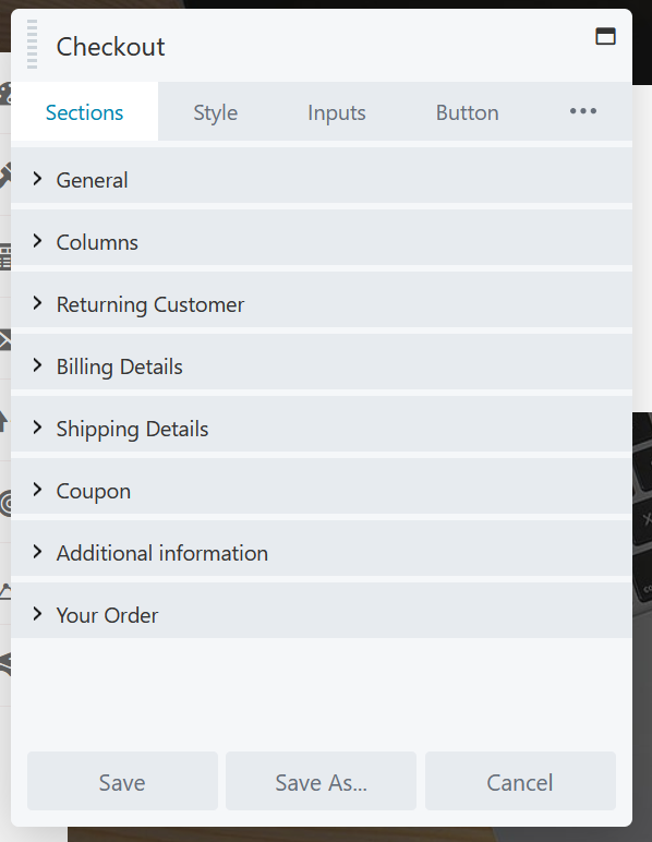
Drag the “Checkout” module from the WooPack modules list into your Beaver Builder page and you’ll see the settings pop up. Click the drop-down under “Style” and you’ll see there’s a choice between “Legacy” and “Enhanced.”
If you leave it on “Legacy,” you’ll only see the column settings shown above. But if you switch it to “Enhanced,” you have many more options, including more layouts, returning customer details, billing and shipping sections, and more. Use these options to customize your user experience and make your checkouts more effective.
3: Better Content Pages
Want to showcase your content? The newly-updated options in PowerPack give you a great place to start.
Go to the design toolbox and click the drop-down box next to “Group,” then choose “PowerPack Modules.”
You’ll see a dizzying array of options for displaying elements of your site, including forms, buttons, star ratings, Google Maps embeds and more. If you can think of something you want on your site, there’s a good chance PowerPack has it.
Three of the most popular updated options are the carousel, the card slider and the advanced accordion.
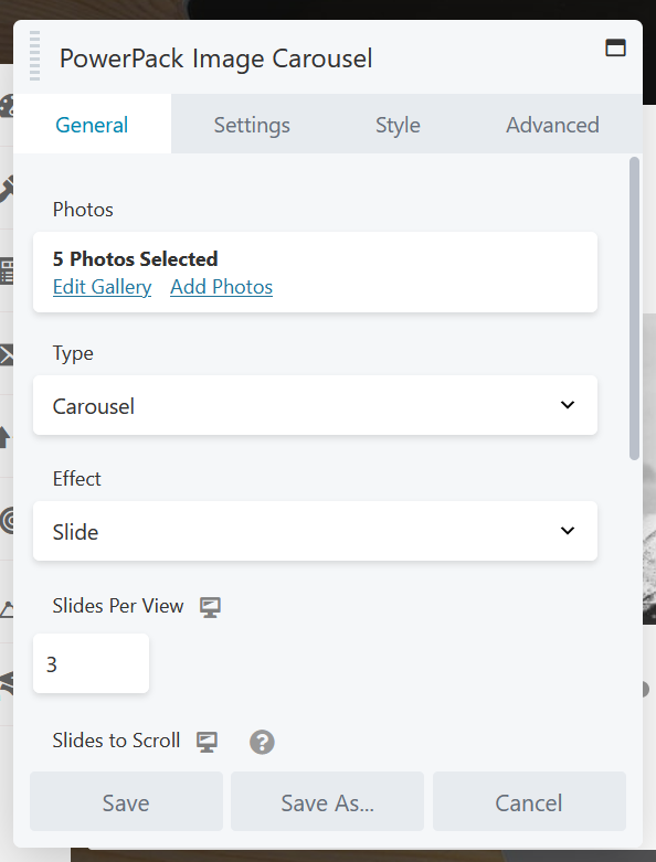
Scroll down to drag and drop the “Image Carousel” module from the toolbox to your page layout. If you can’t find it, click the magnifying glass at the top right of your design toolbox and search for “carousel.”
Once you’ve dragged it to the page, the settings will pop up. Choose the images you want from your media library (or upload from your computer) and they’ll populate on the page.
Change your carousel’s display options to your own liking, then click “Save” to finish.
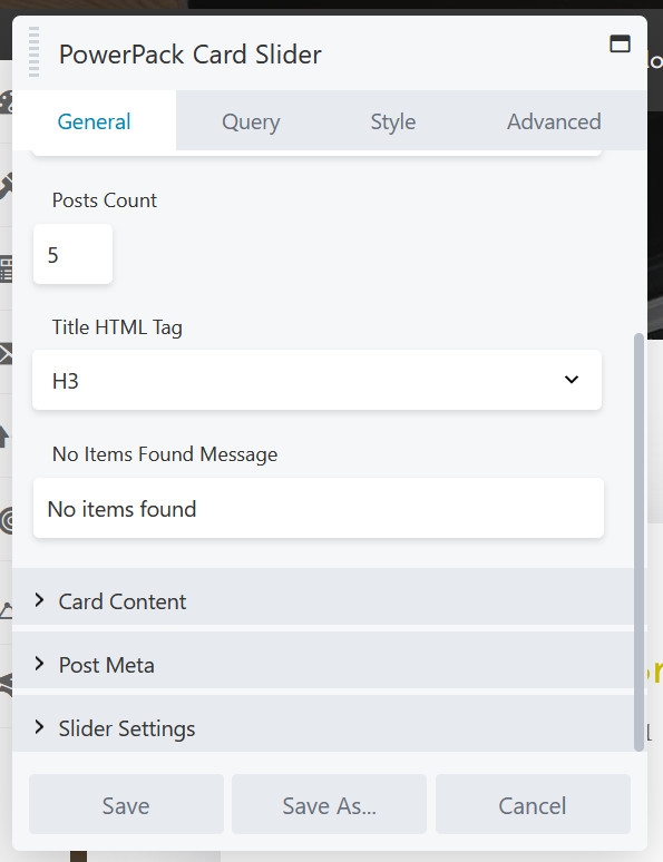
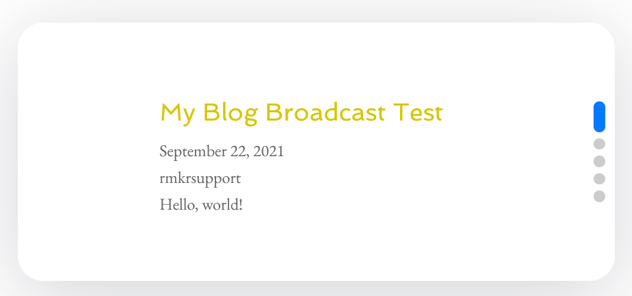
The card slider is another option that allows you to display multiple elements on the page at the same time. It’s often used for posts and mimics the style of an old card catalog digitally. Drag the “Card Slider” module into the page and the settings will pop up.
Here you can edit how many posts (or custom items) show up, what parts are displayed and more. Click “Save” to finish.
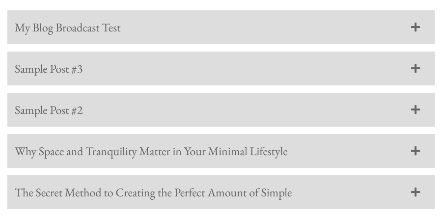
The Advanced Accordion module lets you display multiple elements in an accordion menu that allows opening or closing each element individually. You can do this with posts as well as images and other items. Drag the “Advanced Accordion” module into the page and the settings will pop up.
You can edit and add items to the accordion from this pane, including images and icons. Or you can switch the source from “Manual” to “Posts” and use it to display your posts or a subset of your posts. Click “Save” to finish up.
Any of these options and more can be great for showcasing your content on a home page, a content hub page and more.
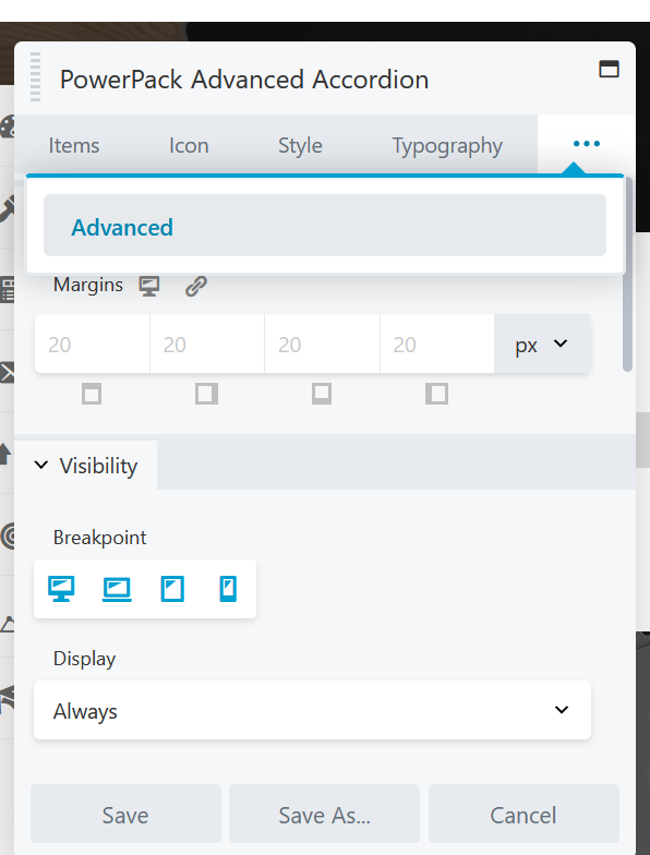
And don’t forget about the new element-level CSS/JavaScript editor. On any settings pane, click the “Advanced” tab (or the three dots on the top right, then the “Advanced” tab) and you’ll see your advanced layout settings.
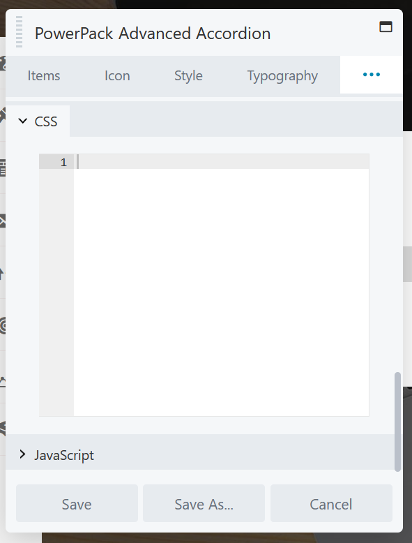
Scroll down to the bottom of the pane and you’ll see two new sections: “CSS” and “JavaScript.” Click on them to open them up, revealing a section where you can enter custom code to adjust the element.
If you’re comfortable with CSS and JavaScript, this can add a whole new level of customization to your Beaver Builder layouts. (Also: if you need a hand with customization, we know a thing or two — just reach out to our Support Team.)
PowerPack and the advanced CSS and JavaScript settings add a deeper dimension of customization and optimization to your Beaver Builder pages. Use them.
A Better User Experience
Building cool pages is nice, but what do these options really give you? Control. From a cohesive shopping experience, to better storytelling, to a more robust user interface for media and content, 3.4.1 gives you the control to help you serve your audience better.
That’s a win for everyone — you, us and the people that buy from you. Use these new features in Rainmaker Platform to create better pages and build your business. (And if you’re still on Legacy and any of these features sound useful, reach out and schedule a FREE demo call to see how the new Andromeda version will work for your site).
Best regards,
David Brandon
Copywriter
Rainmaker Digital Services
