Welcome to this month’s State of the Platform.
When I think about web design, it takes me back to being a technology-crazy 10-year-old. My uncle gave me an old copy of Dreamweaver, and I spent countless hours dabbling in it. At the end of all my effort, I had a somewhat functional website (though I never hosted it). It … wasn’t very good, even at the time.
32-year-old David isn’t much better at web design than 10-year-old David, if we’re keeping it real. But I can make something a thousand times better than that with the push of a button using Rainmaker Platform. All I need to do is choose the right theme.
A theme changes your whole site’s appearance in one fell swoop. Fonts, colors, design elements … everything comes out of the box ready to go. But where do you go from there if you want to make changes?
This month’s State of the Platform takes a quick look at web design, specifically how you can use the Styles control panel to adjust your site’s appearance.
The Power of a Theme
We’ve written previously about how to change and edit your theme. Just go to Design > Themes and choose from any of our 40+ regular themes. You can also give us a custom Genesis child theme and we can set it up for you ourselves. After you’ve chosen your theme, you can customize via either the “Customize” button on your active theme or through Design > Appearance (both lead to the same options).
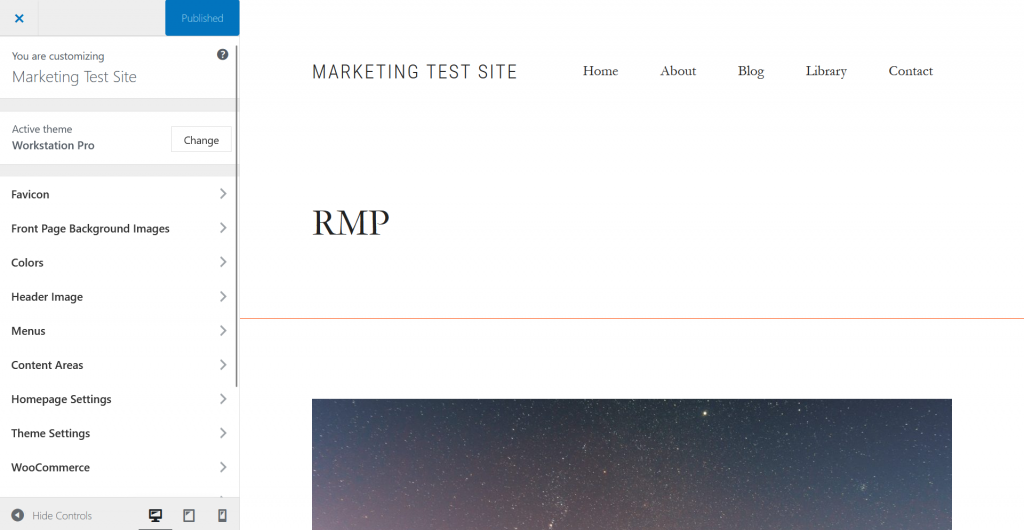
Those theme customization options let you do things like change a background image, switch up your menu options and manage the footers (for more on that, click this link, check the Knowledge Base or contact us). They don’t, however, give you the options to change your fonts and site colors.
Customized colors and fonts turn standard sites to standouts. Here’s how to change them (and a few potential issues to be aware of).
Using the Style Editor
Go to Design > Styles in the menu. Here you’ll see all the style options for your entire site laid out.
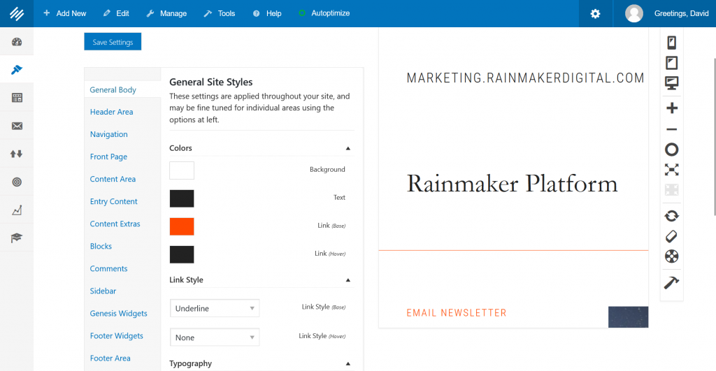
Take a look at that menu on the left of this page:
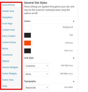
That first option that says “General Body” controls all the styles for your entire site. Here you can change background colors, link colors, link styles and body fonts.
Each of the other options (except for “Tools,” which we’ll get to in a bit) controls a specific area of your site like your header, your blocks and your sidebar.
The settings under “General Body” apply to everything unless overridden by another section or custom code.
On the right side of the Design interface, you’ll see a preview pane. Every change you make on the left side will show up live in the preview pane, so you can adjust on the fly and see what it looks like.
The three screen options at the top right of this preview pane show you what the site will look like on phone, tablet or desktop (in that order). The middle options allow you to zoom in and out, reset the zoom or make it full screen. At the bottom you can refresh the preview, clear the preview and save your settings.
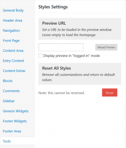 Notice this is displaying my home page as the preview. That’s great if I’m adjusting the whole site’s settings, or messing with something that I know will show up on the home page, but what if I want to preview something that doesn’t appear there?
There’s a way we can do that. We’re currently in the “General Body” settings. Let’s click on “Tools” in the menu on the left of this page.
We can add the URL of another page on our site to use it as the preview page; this lets us check elements that don’t show up on the home page. We can also choose to see a page as if we’re logged in.
Once we’re finished editing any part of these settings, we’ll need to click the blue “Save Settings” button to save our changes.
Colors
We can change font colors, background colors and link colors in the “Colors” section.
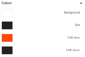
These are pretty self-explanatory. Click on the color swatch and you can change the color, either choosing it manually or adding a hexadecimal code for the color you want.
Be careful when you change colors. Color is the single most important thing you need to be mindful of when you’re changing theme elements. It’s everywhere on your site, and if you choose colors that don’t work well together, you’re going to turn people away. You need a unified color palette.
Color theory is a massive topic far beyond the scope of this piece. And honestly … I’m a writer, not a designer. I’m not qualified to expound on it. But there are a ton of useful resources out there that can help you either build palettes yourself or just use palettes other people have created. Here are a few:
- Color Hunter: Lets you create a palette based on an image.
- COLOURlovers: A community where people create, talk about and upload palettes.
- ColorExplorer: An online palette creator and manager.
You should also be careful that the colors you choose for your site can be understood by the visually impaired. There are tools for this too:
- WebAIM Contrast Checker: This contrast checker is specifically designed for accessibility. It also has resources for you to read more if you’re interested.
- Colour Contrast Checker: A simpler checker that gives you a basic pass or fail for each color you input and lets you check fonts against them.
Those resources will help you decide which colors work with your site and add them here.
Fonts
Fonts are the other major design decision for your site. We can access the fonts in the “Typography” section.
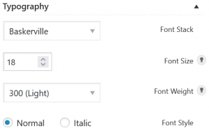
Here we see Baskerville is our “font stack.” A font stack is more than just a font. Not every browser or every operating system will support the same fonts, so a font stack lists the preferred font options. If those aren’t available, it has a list of fallback options. In this case, Baskerville is our preferred font.
Font size is defined here in “points,” as you’d see in any text editor. Don’t drop the size too low; small text is hard to read, and it’s worse on small screens. 18 (as we have here) is a standard for today’s browsers. Some fonts may still display well when you add or subtract a point, but stick to something in that vicinity.
If you’ve used Microsoft Word, you’re used to Bold and Italic as formatting options to emphasize certain words. Font formatting works a little differently online. You can choose a weight (light, regular, bold) and add a style to that (normal or italic).
Try to choose a font face that’s easy to read. Most of the options you’ll be able to choose from will be visually clear enough that you don’t have to worry about readability, but make sure you preview. If it feels even a little hard to read, don’t bother; your body copy needs to be clear first, visually interesting second.
Typography is critical to the design of a website. The right font face can change the way your users perceive you. We’ve covered the basics of typography for the web on the Dispatch before if you want to get a quick overview. For a deeper dive, the book Professional Web Typography is available for free.
Other Settings
- Link style: Usually not worth bothering with; people are used to seeing underlined links on hover and no underline normally, so unless you really feel strongly about that design element don’t bother.
- Padding and margins: You’ll see options for these under some of your individual settings pages. Margins and padding govern spacing. Margins determine the space between the border of an element and other elements on the page. Padding determines the space between the content inside an element and the border. Be very, very careful when adjusting these; it’s easy to accidentally make something illegible or ugly if you adjust them too much. Usually best to leave alone unless you’re having an issue.
Be Intentional
The #1 thing you need to keep in mind when you’re adjusting elements in the Styles page is this: be intentional. Don’t be haphazard. Every color and font you pick isn’t just an issue of “what do I like,” but “what works well together visually” and “what’s going to make my message clear.”
Choose carefully, preview your changes and follow best practices. And keep in mind that the theme was designed by people who are expert designers themselves — there’s a reason they made the choices they did. All of the style elements already work together well. Your Rainmaker Platform site is ready to go out of the box. Through the Styles page, you can make your site your own — within the parameters of the theme you’ve chosen.
You can add other themes by talking to Client Services, and if you want a custom theme you can reach out and we can help you build one. Of course, if you’re comfortable with CSS, you can always add your own CSS code.
In cases where you want a really custom option, we can create a fully customized site for you.
We want you to have a beautiful site that represents you, whether it involves something as small as a font change or as large as a custom deployment. If you need a hand or have any questions, reach out to us. We’re here to help.
If you want to learn more about Rainmaker Platform and how to use it for your business, stay tuned for our next webinar on September 7, 2022. We’re covering LearnDash — how you can use assignments in your courses. Bring your LearnDash questions and comments; we’re going to make this one interactive. Stay tuned for more details (including how to sign up), and if you have any interesting ways you’ve been using assignments, drop me a line.
Best Regards,
David Brandon
Copywriter
Rainmaker Digital Services