Content marketers are usually more concerned with the words they create than the appearance of those words.
Content is important. Absolutely. But the way the content is presented matters too. It’s a mistake to ignore the design elements for content entirely — and it’s one a lot of content marketers make.
You have to be concerned about how your content displays. And that means typography.
You need a working understanding of type, and you have to embrace how the font you select impacts the understanding of your copy. This is practical typography, and we’re here to show you what that means.
Find Your Focus
As a content marketer, your goal is to get across a message. Great typography helps in two ways:
- It doesn’t impede reading.
- It creates context for your message.
The first one is pretty self-explanatory: use styles that make your text readable. Text size, font, color and alignment all matter. Emphasize readability over aesthetics whenever there’s a choice between the two.
The second is more subjective but easy to understand with an illustration. Take the same two-word phrase and set it in two different fonts:
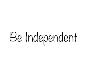

The first one feels casual and approachable. The second is emphatic and authoritative. Neither is right or wrong but they are very different.
Choose a font that matches what the tone you’re trying to create. Don’t pick a font just because it “looks cool.” Choosing a font that matches the sentiment of the message will add context. The font you select changes how the reader interprets your words from quirky to bold, retro to sophisticated; the font can create the vibe all by itself.
You need to decide first what your focus is. Yes, your copy needs to be legible. But you may want to use more artistic fonts for some elements, and your focus will help you choose those. Or maybe you want to go as barebones as possible to let the text stand on its own. There are a number of approaches, all valid — it just depends what you want to accomplish.
Once you figure out what your focus is, you need to dig into the basics.
The Basics of Practical Typography
We’ve talked about craftsmanship vs. creativity a lot recently. Creativity is nice, but that basic craftsmanship ensures that the reader understands your intentions.
Here are the three things you absolutely have to know about typography as a digital content marketer.
Mobile Matters
Written communications have gone mobile. Mobile traffic accounts for about 54% of all web traffic, and it’s slowly climbing still. Big companies like Google are reading the tea leaves and leaning into mobile first over desktop. That means smaller screens with less reading real estate.
When you’re choosing fonts for your site, use font families that are easy to read and well-supported. Don’t go crazy with fonts that might not load correctly or may be difficult to read when small. Simple faces like Arial and Times New Roman consistently render the same. Consistent appearance is a writer’s best friend. Save graphical fonts for images or elements that aren’t being generated through CSS and HTML. It’s important for desktop — it’s doubly important for mobile. Don’t break your site.
Try to go with a minimum of 16px for body text, usually bigger. Headlines need to be at least 2 pixels larger; captions can be as small as 10 px. Don’t be afraid to err on the side of too big.
Line height matters too. Keep appropriate “leading” or line spacing in there to ensure your text is easily readable. The maximum is 30% of character height. And keep your line lengths reasonable. Around 60 characters per line will allow you to maximize readability on desktop, while 30 to 40 is ideal for mobile.
Most modern CMSs include responsive design to make mobile adjustments automatically, but if you’re concerned the text appears too large on desktop, consider adjusting the CSS. Google even recognizes the importance of typography; it flags sites as being not mobile friendly if text is too small or too close together. This will negatively impact your search ranking.
Simple Succeeds
Once you start seeing the possibilities of typography, it’s easy to go crazy with it. Four, five, six … I’ve seen up to nine fonts on one site.
As a general rule of thumb, stick to one font for the copy and one font for headlines (or use the same font!). Any more than that and you run the risk of confusing the eye instead of adding visual interest. Don’t muddle your message.
Be purposeful with your font choice. Don’t choose a font just because it’s pretty — it has to serve the message.
For example:
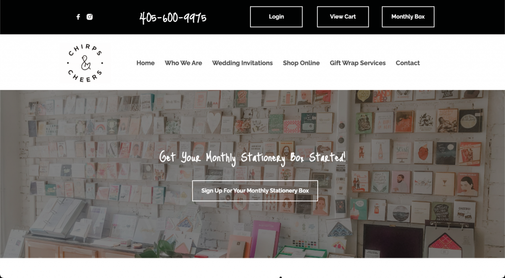
This isn’t bad, but the script font makes it much harder to read the text in the middle of the page. What’s worse is using it for the phone number. It’s not immediately legible, and it could easily be misread.
And look at this barely legible product name:
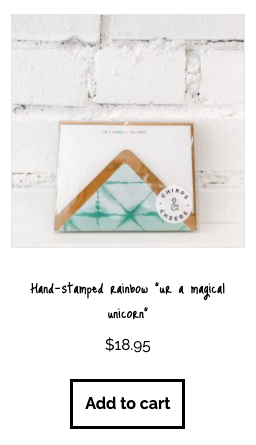
The font matches the aesthetic the company is going for, but the end result is hard-to-read copy. The point of text is not aesthetics. It’s information conveyance. If you can’t read it, you can’t understand it.
Contrast the above with Martha Stewart’s site:
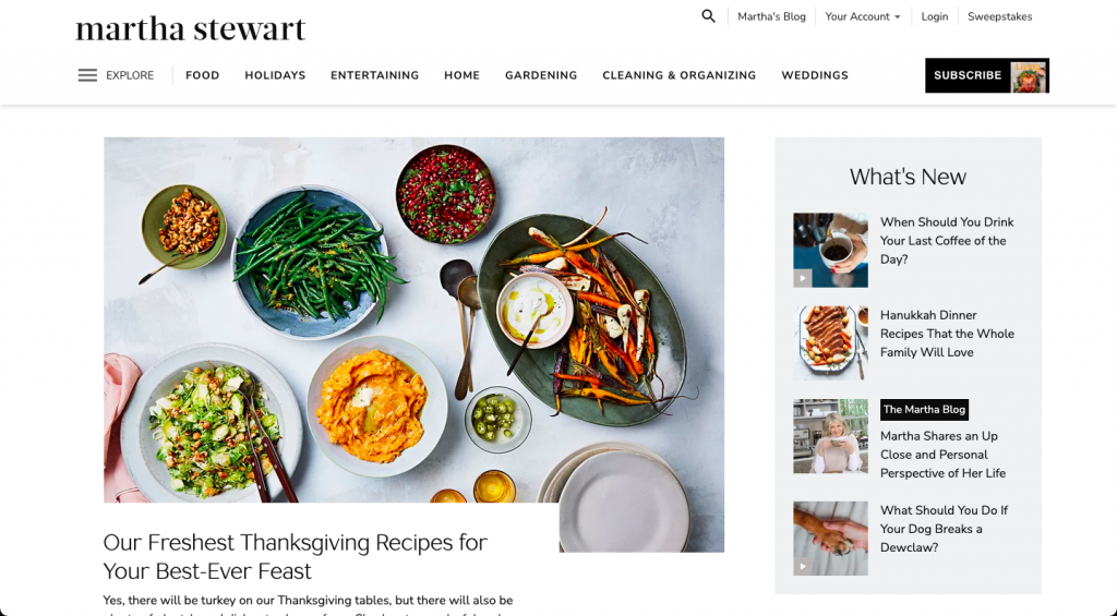
It’s clean and incredibly readable. You could make the case that it’s a little less visually distinctive, but it does the job it sets out to do.
Good typography makes your message clearer. Bad typography obscures it. Don’t get in the way of your own message.
Complements Cooperate
Your fonts need to complement each other. An easy starting point is pairing a serif font with a sans serif font; they tend to work well together. Consider using one font family throughout and simply changing font weight, size and formatting. It’s an easy way to create a little contrast to maximize understanding and visual flow.
There are thousands of books and college classes devoted to the study of typography. If you can read only one, take a look at The Elements of Typographic Style. We don’t have the space or the time to get into the nuances of pairing fonts.
Typography is as much art as science. There are rules, but intuition matters too. And intuition is just our subconscious putting together conclusions based on what we already know.
Paired fonts should include elements that match, but also elements that contrast. Weight, height and style are all elements that can match or contrast. Mix and match till you find something that looks consistent — and don’t be afraid to ask for professional help if you need it.
A Layperson’s Intuition
You don’t have to be an expert in typography to create clear, attractive, easy-to-read content. The elements of craftsmanship that make typography work aren’t magic. Combine a little know-how with a layperson’s eye and you can usually make something pretty good — you may not add a lot to your message, but you’re not going to take away from it.
It’s easier than ever with modern web design to get your typography right. But if the idea of selecting the font for a site seems overwhelming, know that you don’t need to go it alone. We’re in this with you. If you need a little help, just drop us a line, anytime.
Best Regards,
David Brandon
Copywriter
Rainmaker Digital Services