Let me start this off with a disclaimer: I hated popups.
I wasn’t a fan of scrolling down the page, minding my own business, when BOOM — I’d be stopped in my tracks by someone asking for my attention. It seemed like everyone in content marketing was asking for an email address so they could sign me up for one more email I wouldn’t read.
But as a marketer, I can’t hate anymore. As much as I disliked those obtrusive windows interrupting my browsing, I found out why everyone was using them: they get results. The average conversion rate for popups — across industries, on desktop and mobile, including everything — is 11%.
An 11% conversion rate might not sound like a lot. But if 11 out of every 100 people who visit your site purchase from you or subscribe to your newsletter, you’re doing very well. Like me, you need to learn to love popups if you want to drive conversion on your site. Here’s your road map to great popups.
What Popups Can Do for You
Popups are designed to pick up people that might bounce. Bounce rates vary a lot, but the average is somewhere around 41 to 55%. Smart use of popups can help you prolong the time you spend with those people who’d otherwise leave.
There are several ways popups do this.
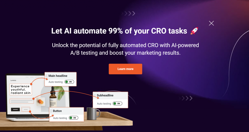
First, they solicit signups. If you clicked through to check the conversion rate in the first paragraph, you might have seen this popup:
When you click “Learn More,” it takes you to a waitlist for a future program. This can also be used for newsletter signups and other tasks that involve capturing personal information.
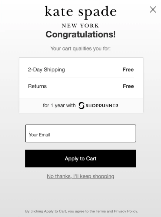
Popups also reduce abandoned carts. Many e-commerce websites use an exit-intent popup (a popup that shows up when the user is leaving the website) to grab people as they leave; often this can result in a 10-20% decrease in cart abandonment. 8 of 10 customers put an item in the cart and don’t buy it; that’s a big chunk of revenue you’re gaining back.
This example from Kate Spade (courtesy of Claspo) uses an offer of free returns and shipping to entice leavers to stay.
There’s also the time-honored goal of increasing sales by offering discount codes, free shipping and other incentives. There can be some overlap here with cart abandonment (as seen above), but this could also be an exit intent popup while someone is shopping.
Any popup solution on the market should be able to help you with any of these tasks; Rainmaker Platform provides two technologies to create popups and help marketers grab user attention.
Whatever tool you use, there’s a simple four-step road map to creating popups that work.
1: Keep the popup simple.
Looking at studies from WisePops, OptiMonk and Drip, the most effective popups use a simple form with only one or two fields. The numbers differ based on source, but there’s usually a 5% or more dropoff in completion rates if you ask for too much up front.
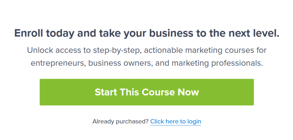
If you can get away with it, only ask for one field — or use a single button to have your user click through to a landing page, like this example from OptinMonster.
Most of the time, the one data point to ask for is the email address; it’s the main identifier used by any online service.
So how do you actually get the information you need?
Think beyond the initial ask. Some programs allow you to create multi-stage popups: you enter one piece of information, then another screen automatically appears once you’ve finished entering that information. Otherwise you can use a landing page. There can be some drop-off, but Drip reported that in its multistage popups, 76% of people who clicked through to a second screen entered the rest of the information. That’s no surprise; they’ve already bought in.
Your popup must be easy to understand, and it can’t ask for too much.
2: Design for conversion.
There are innumerable design possibilities for popups, from animation to color to font. We’re focusing on two that significantly affect conversion: location and graphics.
The location of your popup is critical. Exit-intent popups or timed popups don’t have this issue; they display based on a time or intent trigger. But if your trigger is based on a location on the page, it needs to be in the right place. Jump in too early and you haven’t even had the chance to say hello; too late and they’re already leaving.
Our recommendation is to have any location-based popups show up once the user scrolls to the “fold”, or the place where the screen cuts off at the bottom. We’ve mentioned this before; engagement tends to pick up just above the fold (around 550 pixels on many desktops), and the bulk of your engaged users will see two screens worth of information. Putting the popup just below the fold ensures that when they scroll down, they’ll see your popup just after the area where you’ve given them the elevator pitch and CTA.
If your popup is in the right place, it will get more attention. So will using images.
Drip checked 20 million popups, both with and without images, and found that the conversion rate was 83% higher for those with images than those without. Including images will help you grab attention and motivate the response you want.
In addition, using an image with someone’s face can help personalize a product. It’s worth A/B testing, but several studies have noticed an increase in attention and conversion when people look at an image of a face. It’s not a hard and fast rule, but it can help.
Put your popup in the right place and engage with the power of images; you’ll reap the benefits in conversion rate.
3: Produce for the user’s device.
58% of world Internet traffic is mobile.
Designing a popup that works well on desktop is great — but if it doesn’t display correctly on mobile, you’re losing the majority of your audience.
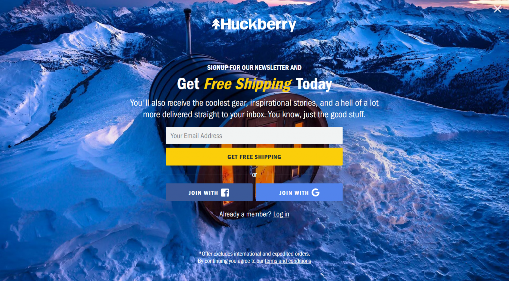
Make sure your popup can handle both, or failing that, create two versions. One of my favorite niche retailers, Huckberry, created a popup that works well for a desktop wide format:
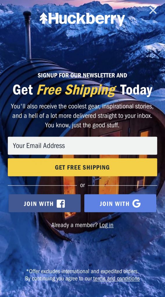
And it also works as a mobile version, which mostly just crops the picture and adjusts the way the text displays:
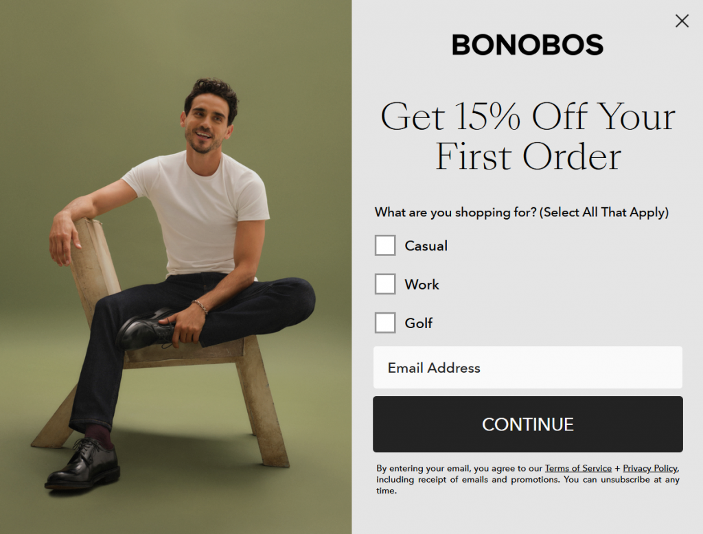
On the other hand, Bonobos built two separate versions for this popup. Here’s the desktop version:
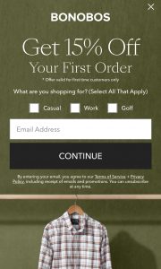
And here’s the mobile version. You’ll notice most of the information is similar, but the image is different and the way it displays is designed for a vertical-format screen:
Building two separate popups is a little more work, but it’s worth it. Make sure it displays the way you want it to for both desktop and mobile users, or risk losing out on half of your audience.
4: Create a strong call-to-action.
A popup is designed to do one thing: deliver a CTA to your audience and get them to act. You’re interrupting them — make it worth their while. This is key. One of the main reason we hate popups is that the content stinks. The audience won’t hate your popups if you give them content that is valuable. Consider using:
Limited-time offers: Time is one of the best ways to make something urgent. Some popups use a countdown timer; others state a deadline. Make clear that this isn’t something that’s going to be around forever.
Exclusivity: The Kate Spade example above says “your cart qualifies you for” the offer. We don’t know the why or how; it just singles us out as a special category.
Your design and your copy should grab your audience’s attention immediately and not give them a chance to think “what if I come back later?”
Popup Practice
I (and plenty of other people) might get a little annoyed by a popup interrupting the browsing experience, but I can’t hate on them anymore. They work.
Don’t be afraid of them. Use A/B testing with your popups to determine what strategies work for you, using these four steps as a guide, and you’ll increase your conversions. And if you need a hand, don’t be afraid to reach out. We’re here to help. Just drop us a line, anytime.
Best Regards,
David Brandon
Copywriter
Rainmaker Digital Services
