Modern websites should be mobile-friendly, or they’re missing out on a huge chunk of potential audience.
Don’t believe me? Look at the stats. About 60% of web traffic today is mobile. That number’s been over 50% since 2017, and it continues to climb slowly. This has had a number of knock-on effects — the rise of responsive web design, Google’s mobile-first rankings and the invention of app/page hybrids like progressive web apps.
You have to change your site to match the times.
There are five areas you need to focus on to make your site mobile-friendly. You may already have some of these implemented — and if so, you’re ahead of the game. But there’s something here for everyone.
Mobile Design
Speed Optimization
Simplified Forms
Mobile Usability
Page Testing
Mobile Design
The most important key to making a mobile-friendly site is the layout.
Old-school, non-responsive websites are not easily navigable on smaller mobile device screens. Modern websites use “responsive” design, which rearranges and resizes the elements on the page based on the size of the screen it’s being viewed on. Take a look at the homepage for RainmakerDigital.com, for example. Here it is on desktop:
And you can see how different it looks on mobile:
Any modern web platform (including our own Rainmaker Platform) supports responsive design and manages those changes automatically. That said, there are times the automatic processes break down. Here are some areas you should manually review:
- Link spacing. It’s easy to click one thing instead of another when they’re bunched together, especially if you have big hands. Leave space between hyperlinks; don’t insert several links back to back.
- Font sizes. Your mobile fonts should be at least 16px. Scale up from there for fonts that are less legible or pages with longer text sections. Learn UI has a great walkthrough on fonts for desktop and mobile if you’re interested in learning more.
- Menu real estate. On the desktop version of Rainmaker Digital above, the menu is spread out at the top right of the screen. On the mobile version, it’s a “hamburger” menu (the three lines at the top right). The “hamburger” menu is a known UI trick for mobile now; people are used to it, and you can even use it on desktop. Screen space is at a premium here, and regular menus can cut off a third of your precious screen real estate. Use hamburgers and keep your menu item names short (1 to 2 words) to save precious space.
If you’re having issues with mobile implementation, many platforms support creating a full alternate mobile-only version of a page. A custom page will allow you to tweak the content, layout, and experience for just your mobile users. This can be a great solution, but it will require extra site management for two separate pieces of content. It works best for pages that don’t change much – landing pages, pillar content and functional pages like the login and contact.
Speed Optimization
Both search engines and users hate slow sites. Google’s “half of users leave if a site doesn’t load in three seconds” statistic for mobile sites is based on a study that took place in 2016 (and is hated by a lot of SEOs for being simplistic), but there’s some truth to it still. One more recent Deloitte study found significant improvements in conversion when mobile sites loaded faster.
One key to faster load speeds is limiting the amount of information you send with each page load. The main culprit is the lack of image optimization.
- Use better compression. JPG and PNG have long been the standard for web images because they hold their quality well in a small file size. Use a good image creation or editing program like Photoshop (or GIMP) that has compression options for web-ready images. Modern web-specific formats like SVG, AVIF or WebP provide better compression than legacy file formats and are becoming more common.
- Keep image size small. This is a mistake I see site administrators make all the time. If the image on the server is 1200 x 1200 and being resized to display at 300 x 300 by the code, the browser still has to download all 1200 pixels of data before resizing. Resize your images before inserting them on the page as much as possible. Today, many platforms will create multiple optimized images from one source image. Some platforms or plugins will take care of this automatically for you. Regardless of how you do it, make the images as small as you can while still meeting your design and quality goals.
- Use lazy loading and other advanced optimization features. Most web platforms offer advanced optimization features along with documentation on how to set up your site for better load times. These features include options that allow your page to just load what people are seeing and reduce the time it takes for them to see something they want.
Another common culprit for slow mobile browsing speeds is site bloat. Turn off any add-ons, plugins or features you’re not using. This is especially common on WordPress and rapid development platforms. At best you’re adding useless code to a page; at worst you’re forcing it to call on an outside source to get resources, both of which add load time.
Site speed and asset compression are a complicated subject, but taking these basic steps will help. Don’t sacrifice content for speed — content is still king, after all — but where you can boost speed without sacrificing the user experience, do.
Simplified Forms
Getting people to put information into a form is hard at the best of times. It’s worse on mobile. The screen is smaller and harder to type on. Browser autofill helps, but you’re still better off cutting back the amount of information you ask for. These days you don’t need much more than an email address and maybe a name.
Keep your form entries to two or three fields if at all possible. One is best (email address). If you want more information, borrow a page from the popup experts and split the ask into two screens.
Only ask for the information you need, and make sure that you’re giving people a good enough reason to give it. You have to ask permission, and the more data you ask for, the more likely it is that people say no. I might give you my email for a useful eBook. I’m much less likely to give my social security number for digital Iron Man armor in Fortnite. Give people a strong reason to pass on their personal information or they won’t.
Mobile Usability
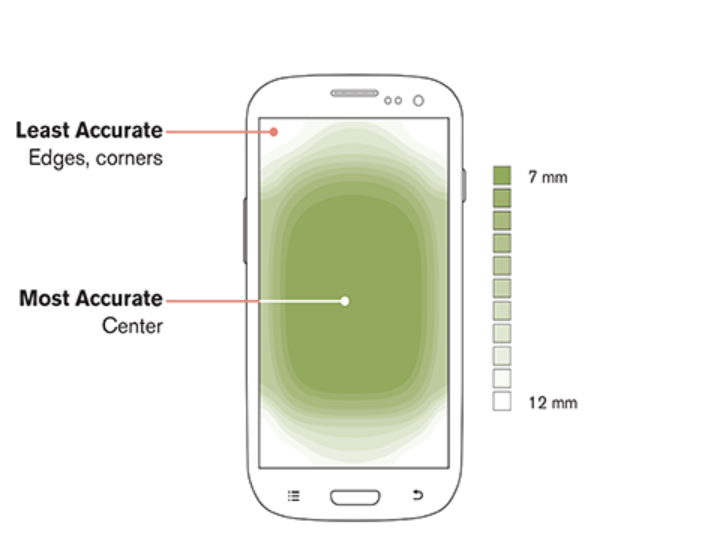
I came across this illustration on Neil Patel’s site while researching for this piece, and it’s a great way to visualize the mobile user experience:
Because of the way we use smartphones (usually with the thumb of the right hand,) the easiest browsing usually happens in the middle of the screen. That means that whatever’s most important should be there.
Unlike desktop browsing, the F and Z patterns people use to scan the page aren’t quite as critical. What’s critical is that they can actually take the action you want them to take; you want your action or your most important element right in the middle. Menus and other secondary elements should go at top or bottom, outside of the main touch-accurate area.
Design your home and about pages (your most-browsed pages) and any landing pages around this understanding.
Page Testing
Finally, test your pages specifically for mobile.
There are a few methods to do this. Use more than one.
First, Google has a checker which works for both live pages and code. Just enter the URL or code in their easy portal.
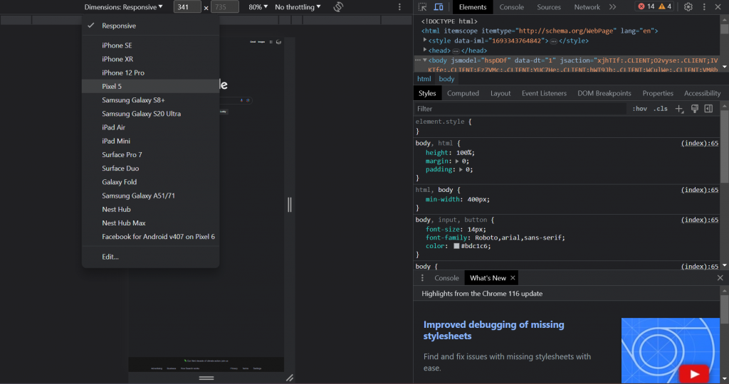
You’ll want to look at your page manually too. Rainmaker Platform lets you preview pages on tablet or smartphone mode. You can also do this in a browser through the developer console, which you can bring up by hitting F12 on desktop and clicking the “Toggle Device Toolbar” button at the top left of the console to bring up the display options. From here, you can view the page as it would look on other devices.
One caution from my own hard-earned experience: there’s no substitute for looking at a page on an actual mobile device. The platform preview and developer console are great emulators, but holding a phone in your hands and using the site the way it will actually be used gives you a completely different sense of what matters in your design.
Ideally, check your site all four ways: Google checker, platform preview, developer console and an actual device.
Make Your Website Mobile
Just having a website isn’t enough. Not every website is primarily used on mobile — and some are still better as desktop experiences. But if your site isn’t mobile-friendly, you’re missing a chunk of potential audience.
Use these five keys to make your website mobile-friendly. And if you’re a Rainmaker Platform user, we can help you through the process. We’re here to help. Just drop us a line, anytime.
Best Regards,
David Brandon
Copywriter
Rainmaker Digital Services


