Building an online store is easier than it’s ever been. But getting someone to buy is a different story.
You can research, build a funnel, do all the right things to get people to select your products or services, but you can’t be sure that they’re even going to be interested by the time they get to the checkout.
Don’t believe me? Believe Shopify, which says that the average eCommerce conversion rate hovers between 2.5% and 3%.
That’s why you need to maximize every chance you get at conversion — by removing friction.
Get Rid of Friction in the Buying Process
When we refer to friction in eCommerce, it’s “anything that gets in the way of your prospect doing what you want them to do.”
In this case, buy.
Think of it this way. Your prospect is on a journey from finding your site to (hopefully) buying your product or service. That journey needs to be as easy as possible, with as few stops as possible.
When I was a kid, we’d go on long road trips every now and then. My dad hated stopping on road trips. He wanted to get from Point A to Point B as fast as physically possible — so before we left, we prepared everything. Snacks and water loaded up in a cooler in the middle of the front seat. Itinerary set to avoid rush hour traffic in any big cities we passed through. Road atlas and maps of each major city in a packet in the passenger seat for Mom to navigate with. We only stopped for gasoline, unless the need for the bathroom was truly dire. Everything was meant to get us to our destination in the fastest and most efficient way possible.
Your prospect’s journey to buying should be the same. The less time and effort it takes to get them to buy, the more likely it is they actually do buy. So how do you streamline that journey? There are three important pieces of the puzzle: selection, selling and process.
Selection
The first area of potential friction is the selection process. That’s the experience the user has as they browse your catalog.
Too much selection is confusing; too little prevents meaningful choice. If you only have a small number of products or services, the UX is unlikely to be an issue. But the taxonomy and organization becomes exponentially more important as your number of products goes up.
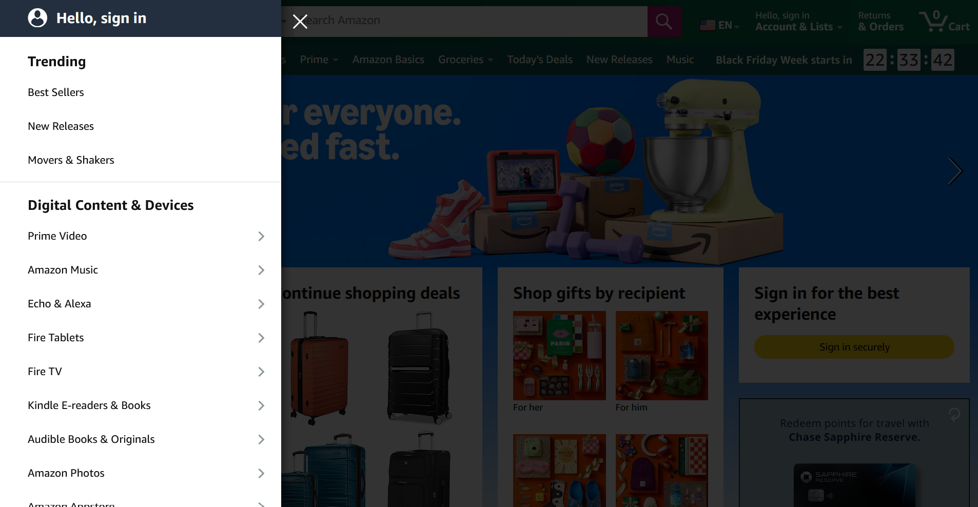
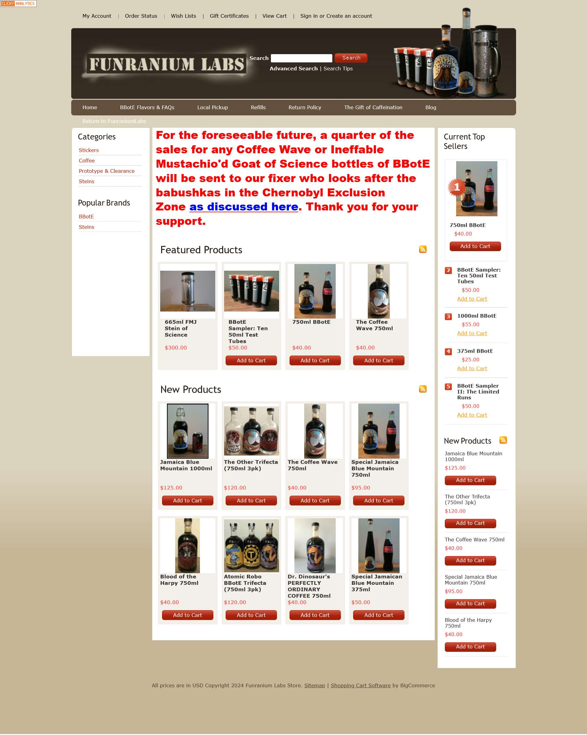
Look at the difference between Amazon and Funranium Labs, a quirky little store best known for its super-strong coffee Black Blood of the Earth. Amazon has a large taxonomy, and if you start going into sub-pages you find a deep network of tags and categories to browse. It’s very well organized, and it needs to be, given that there are over 350 million products on its digital shelves.
Funranium Labs, on the other hand, has a mostly undifferentiated list of featured products. There are a couple of issues with Funranium Labs’ page that could be solved pretty quickly, and you can probably pick them out after seeing the Amazon page.
First, when you’re doing a taxonomy of your products and services, make sure each variation isn’t showing up as a different product. Different sizes or different brandings are showing up as individual listings instead of appearing on the same product page. Ideally this should be avoided.
You need to think like your customer. Your catalog organization should make sense to them. Your most popular product (in this case, the 750mL version of the coffee) should be front and center. Also, in this case, the menu on the left serves its purpose by showcasing the categories. But be sure to consider where your customer is most likely to look for a particular product. For example: if you’re running an outdoor supply shop, do you put knives with hunting supplies? With small pocket-sized accessories? With rifles (another weapon)? Consider what makes the most sense for your users and organize accordingly.
I’ve worked on some sites that have had some real issues here. They often (like Funranium Labs) tend to be small retailers that have expanded their product or service range due to demand, and have just kept adding over time without updating the look, feel or organization of the store. Good tagging and categorizing will help your prospects actually find the thing they want to buy instead of leaving the page; even if you only have a couple of products now, take the time to do it right. It only gets harder with time.
(By the way: I love what Funranium Labs is doing, and this is by no means a shot at them. It’s a side hustle that makes them money and they aren’t putting a ton of effort into the page; this is just an example of the organizational issues many small eCommerce shops face).
Selling
Friction also comes with the actual selling. An unclear product page or one that’s missing information will cause a lot of your prospects to bail before they reach the destination. We’ve broken down product pages in more depth before, but as a reminder, there are three b’s we want to be aware of: branding, benefits and buy now.
Branding
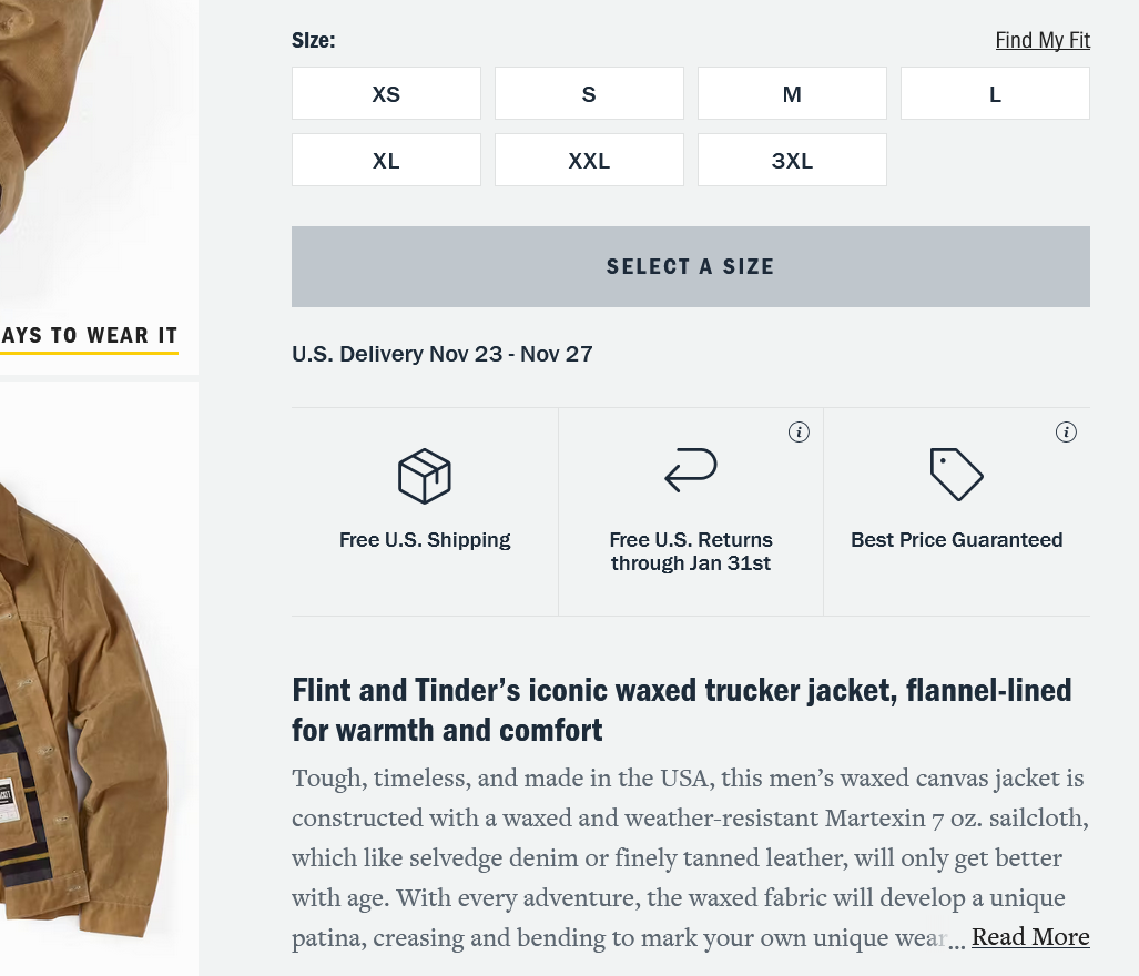
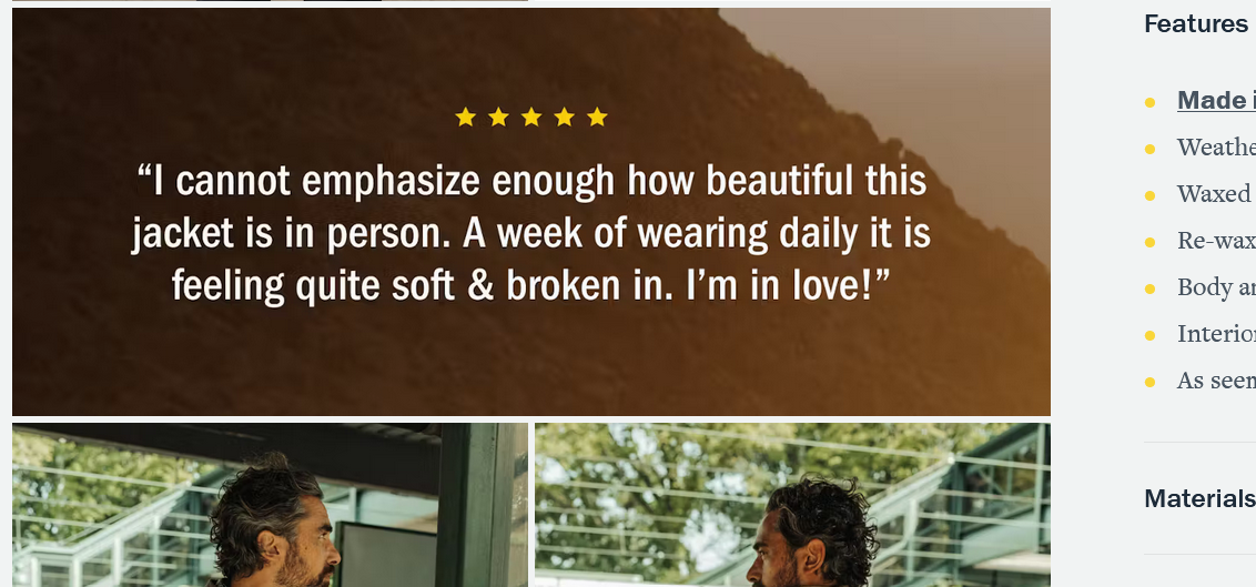
You want something that makes people interested in the product. This isn’t informational copy; this is selling copy. Reviews and social proof count as branding for your product page as well. Take this trucker jacket from Huckberry, for example. The first piece of copy you see after the size and color chooser is selling — a couple of brief callouts and then a product blurb:
Among the images on the left side is a review callout:
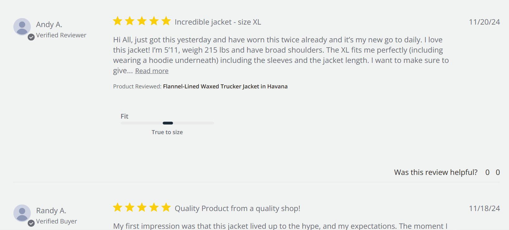
And scroll down far enough and you’ll find all the current reviews:
There’s even more “branding”-type content throughout the page designed to immediately answer the prospect’s question: why should I buy this jacket from you? Yes, your prospect wants information to answer that question … but they also want emotional connection and reassurance. Give it to them.
Benefits
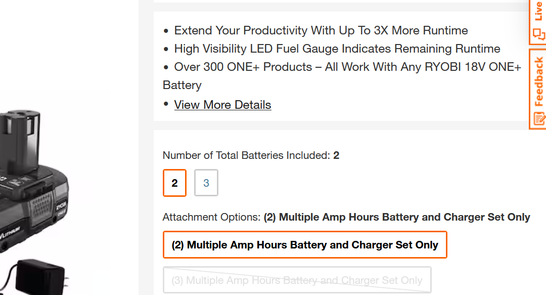
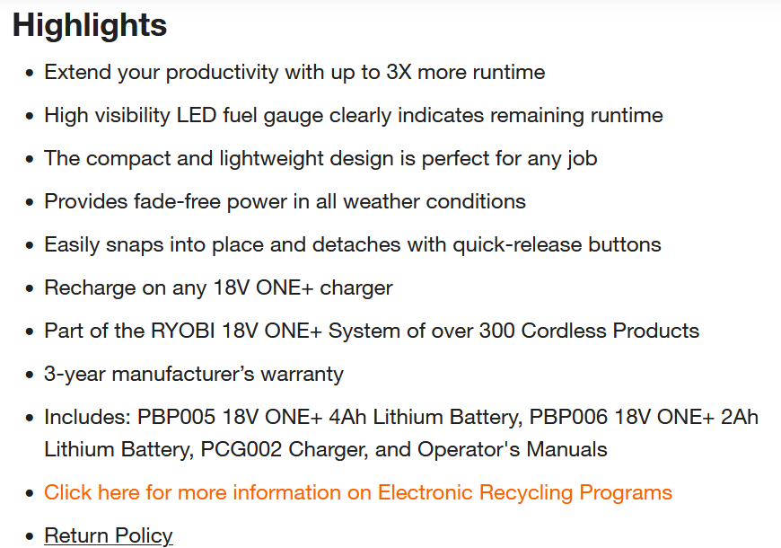
Why buy? What are the benefits? Without understanding the benefits, few will buy. Add information, often in the form of dry, fact-based bullets, and several clear, well-defined product images. Give them the details.
Here’s an example from Home Depot:
I can tell you from my experience working for one of its vendor partners that Home Depot requires sellers to provide multiple benefits for every product. It’s good practice, though I found it a little frustrating while trying to come up with unique and interesting benefits for a zip tie.
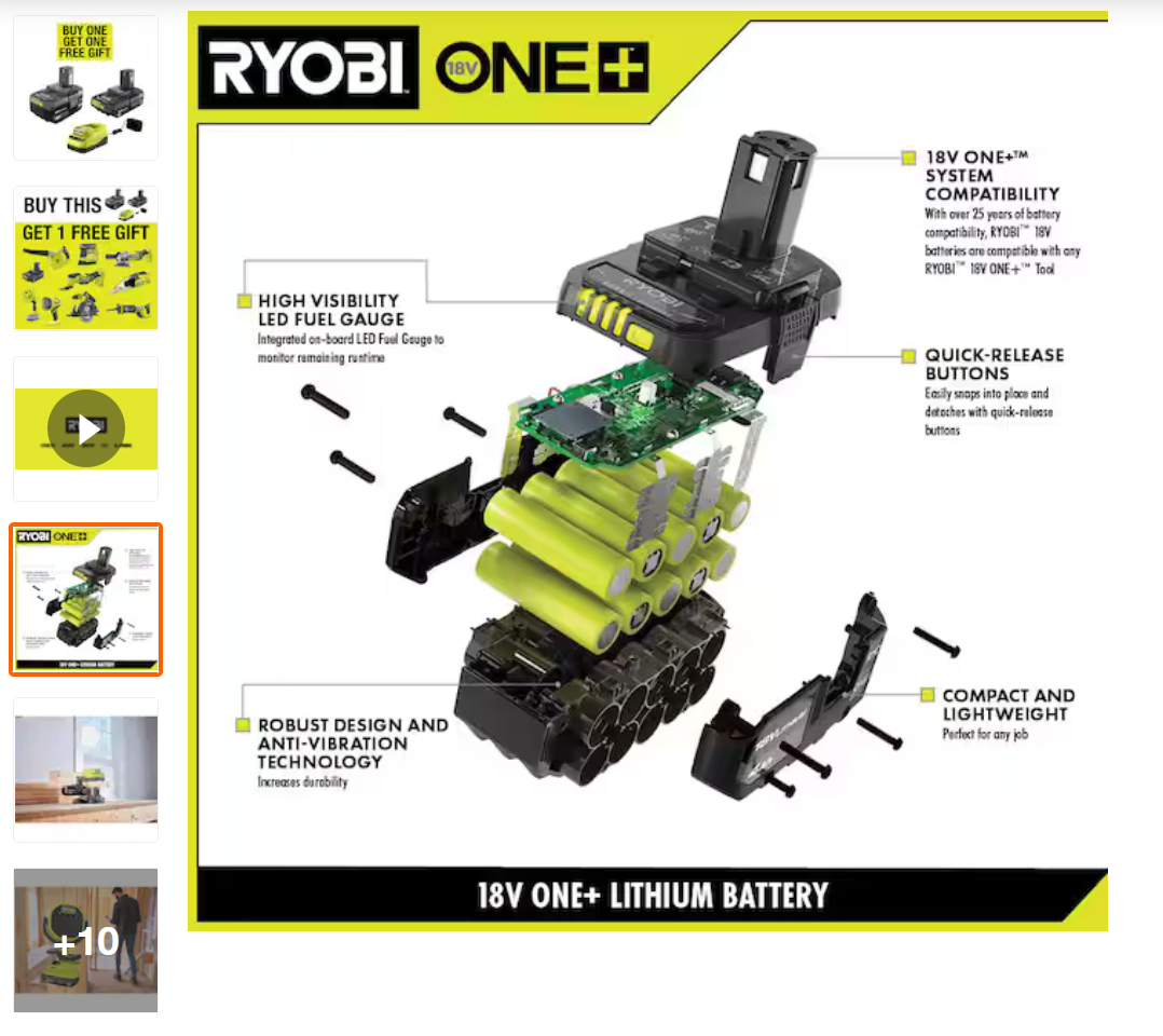
They’re also sticklers for product photography, requiring a large array of high-quality photographs from every angle to be included in the listing:
It made them a pain to work with, but there’s a reason they’re so particular. This information is there to make sure this is the product or service that the Home Depot buyer wants and that it fits their needs. The same is true of photographs, though these actually serve an additional purpose in adding visual appeal to your branding. 75% of shoppers rely on photos to make purchasing decisions; bad images (or worse, none at all) don’t just add friction, they’re basically sandpaper.
Make sure this information is clear, and make sure there’s plenty of it. More is better — if there’s more than you can add next to the product, do what most big eCommerce sellers do and put some of it further down the page:
If you’re a reseller and you’re not generating the copy for your products yourself, it’s easy to just copy what you get from the manufacturer and call it a day.
Don’t.
That information is highly variable in quality. Manufacturer specs are also often (especially if you’re buying from overseas) riddled with grammatical errors and copy issues. Take the time to read through them, check them and fix them. Nothing kills a potential prospect’s interest faster than bad information.
Buy Now
The last source of eCommerce friction is the actual buying process. Your pricing and your “Add to Cart” or “Buy” button should be obvious on the page.
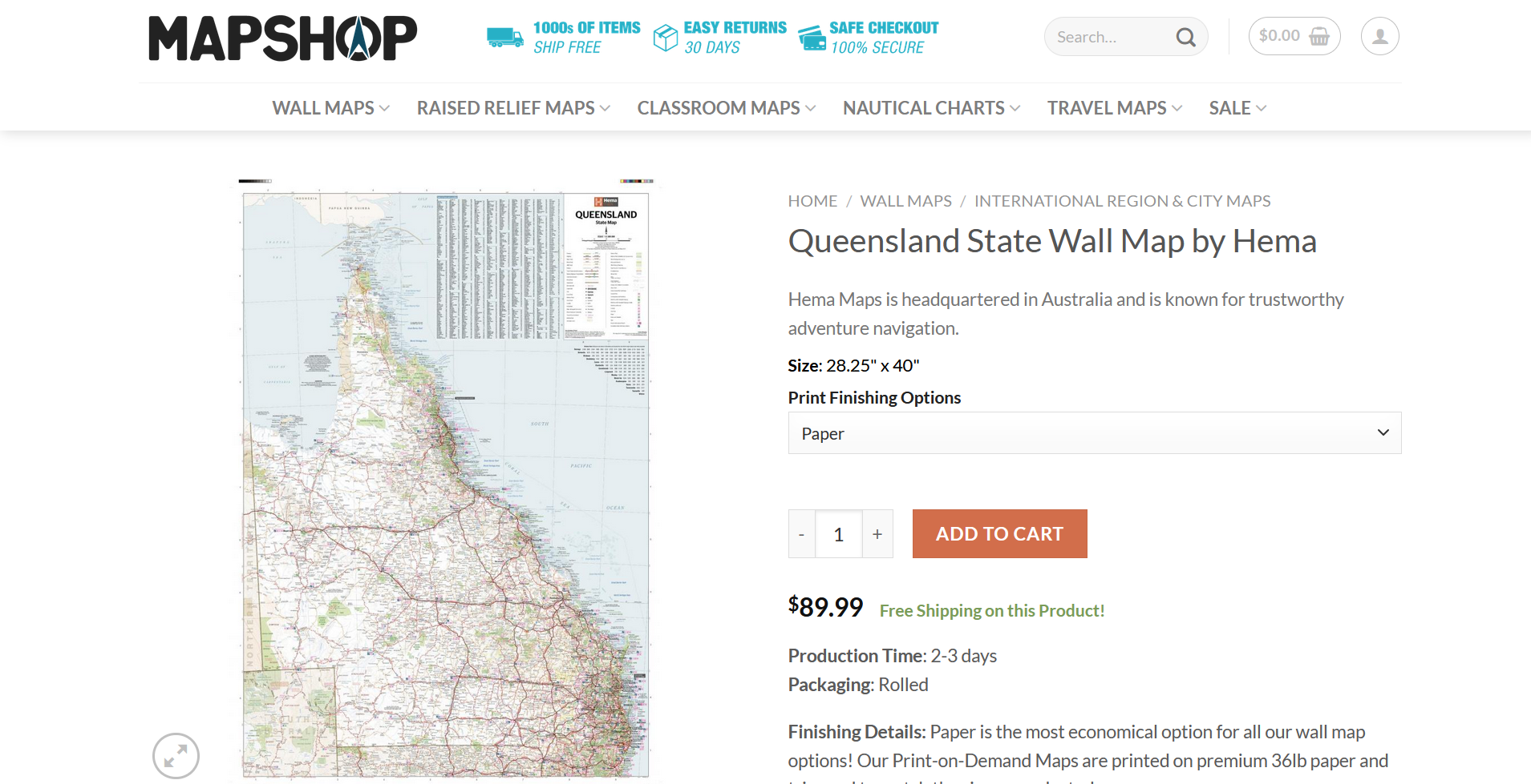
I’ve been looking for a couple of wall hangings to spice up my room and found this map shop. It has a very clear buy now option:
The orange “Add to Cart” button leaps off the page, with both a high contrast in color and plenty of surrounding white space. The pricing next to it is bold and in a larger font than the rest of the page, and the free shipping notice (also pricing-related) is in a different color font to call attention. There is absolutely no mistaking where you go to buy this map or what it costs.
Branding, benefit, buy now. These are the three areas to minimize friction on the product page while you’re selling your prospect.
Process
So what happens after they click the button to buy?
That’s our third area to minimize friction: the buying process. They’ve made the purchase decision at this point — our job is to keep them from un-making it. That’s not easy. 70% of all shopping carts are abandoned. We want to shepherd them all the way to the finish line, and perhaps even guide them back (though abandoned cart emails are outside the scope of this guide).
To keep the process of buying as frictionless as possible, we need to make our checkout a smooth, painless process. There are several aspects to this.
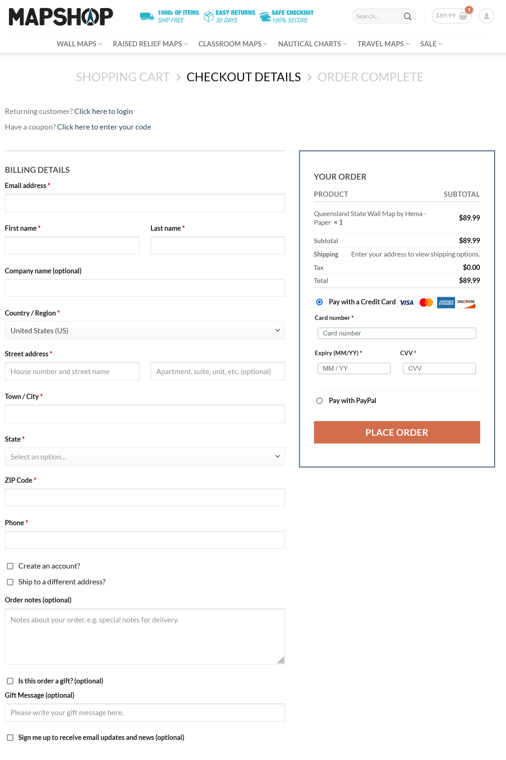
Let’s take a look at our map shop again:
There are several things the Map Shop does very well here.
First, they don’t force customers to create accounts to buy. (The elephant in the room: Amazon does, but they’re Amazon, the largest retailer in the world. They have the clout. You don’t.) The Map Shop checkout isn’t locked behind signing up for an account; instead, there’s an opt-in checkbox to create one. Forcing account creation increases the risk of the prospect abandoning the sale.
They also don’t ask for too much information. There’s shipping information, contact information, payment information and options for gifts and future updates. Everything needed is on one page, as more than one checkout page increases the risk of cart abandonment.
Multiple payment options are good too. In this case, credit cards and PayPal are supported. The more options you support, the better, but these are the two most common.
Keep your checkout simple and easy to understand. Remember, most purchases are now made via mobile devices, not desktop or laptop computers (though that can vary based on your audience). The simpler your process and the less real estate it uses, the better.
Make The Sale Easy
eCommerce tools are better than they’ve ever been — it’s never been easier to set up an online store. But while it’s easy to create your store, it’s a lot harder to convert prospects into customers. Take these tips and reduce the friction of your eCommerce site so your audience buys instead of just browsing. And if you need a hand, we’re here to help. Just drop us a line, anytime.
Best Regards,
David Brandon
Copywriter
Rainmaker Digital Services
