You can have the most creative content in the world, but if people don’t respond to it, it’s worthless. Content has to drive action.
Bad creative on your landing pages will torpedo your campaigns. On the flip side, great creative will make your landing pages work. Don’t believe me? Believe Barack Obama, whose landing pages went up 40% on signups with a creative change.
The key to more conversions for your landing pages is a compelling call to action, or CTA. A good CTA gets people to do what you want them to do.
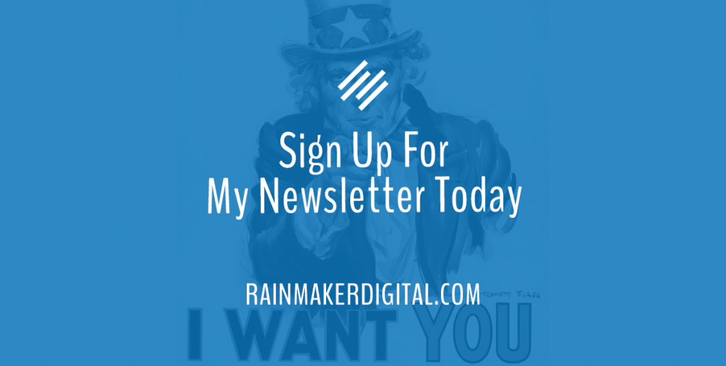
Here’s an example of a good CTA:

It’s clear, concise and straightforward. The benefit is clearly articulated. It’s not fancy, but it gets the job done.
Contrast with this:

No one can tell what’s going on here. There are two CTAs, and neither has a verb. The details are included but the benefits are fuzzy. It doesn’t work.
There’s no magic “best” CTA, but there are best practices you can follow to create a good one — no matter what audience you’re talking to or what you’re selling. Here are the best practices to follow for effective CTAs.
Begin With a Command Verb
If you want people to take action, tell them what action to take.
That means starting with a command verb.
A command verb is a word that orders your audience to do something. “Get,” “click,” “find,” are all command verbs. There are a number of actions that would constitute success depending on what you’re trying to accomplish.
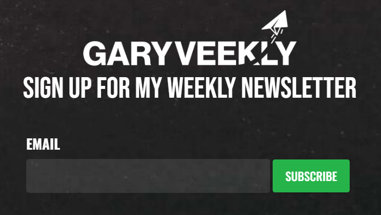
Don’t overthink it. Use the specific action you want them to take. “Download,” “subscribe,” “buy,” “shop,” “order,” “book, “schedule,” “try” are all good options. Look at the Gary Vee example “Sign up for my weekly newsletter” — it’s very clear what the action is.
On the other hand, something that has a little intrigue can be good too. “Learn More” is a classic converting action for low-commitment landing pages. “Explore” and “Discover” are good for those pages as well.
If you look at our examples, “Sign Up for the Weekly Newsletter” has a clear command verb: Sign Up. The other CTA doesn’t even have a verb.
Explain the Benefit of the Action
“What’s in it for me?” is the age-old question that drives marketing. If you can’t answer that question for your customers, you don’t have a functional campaign.
Your copy should have already told people why they should take action, but you need to summarize in your CTA. If the point is a free demo, say something like “Schedule Your Free Demo” or “Get Your Free Demo.” If your benefit is a newsletter like the Rainmaker Dispatch, say “Subscribe to the Rainmaker Dispatch.”
Look at the Gary Vee example: “Sign Up for the Weekly Newsletter.” “Weekly Newsletter” is the benefit. It’s very clear what you get from the signup. Make sure there’s no way to miss the benefit.
Drive Urgency
You don’t always need an urgency word (you’ll notice our example doesn’t have it) but it’s an important factor in most marketing. Our example would be even more powerful with a word like “now” or “today” in the CTA.
Urgency is the afterburner for your CTA. It’s not the main driver of action — that would be your benefit — but if your benefit is already clear, urgency makes it work that much better.
The primary way to drive urgency is fear of missing out (FOMO). FOMO can take several different forms:
- Time. This deal expires soon.
- Social. Everyone else is getting the benefits and you’re not.
- Quantity. There’s not much left, and if you wait you might not get it.
Using words like “now” or “today” in a CTA can multiply your click-through rate (CTR). One small change can result in as much as a 90% change in conversions. You don’t want people to think about taking action and walk away — if you let them walk away, there’s a good chance they won’t come back. You need them to take action while you have them on the hook.
Protip: There are different levels of urgency. As entrepreneur Marcus Taylor notes for CXL, there’s no “always right” word to use. “It turns out that the right amount of urgency depends on the context,” he says. Split test your urgency words — you may find that “today” works better than “now,” or “this year” works better than “this month.”
Use Simple Language
The average person reads at an 8th-grade level. A good CTA is simple and uses short, well-known words. One or two syllables is best. It should be able to be taken in by the average reader in a single glance; they shouldn’t have to read it out word for word. The more effort you make your audience take, the less likely they are to engage.
Make it easy. The easier your copy is to understand, the more people will be able to pick up on your meaning — and the more people pick up on your meaning, the better your conversion will be.
Look at our example “Sign up for my weekly newsletter.”. Every word is clear, most of them are one syllable, and everything is understandable on the first read.
Always Test
Marketing is both art and science. The best way to determine whether your CTA (or any marketing content for that matter) works is to test it.
There are two types of testing: qualitative and quantitative.
- Qualitative: This is observational and tied to opinions. Focus groups are a great method for this kind of testing; on a more informal level, passing ideas by family and friends would qualify for this as well.
- Quantitative: This testing sets two (or more) elements against each other in an A/B test and then analyzes performances against metrics like CTR, CPC, and conversions as well. Quantitative testing is the backbone of most CTA analysis.
Split test your CTAs, and only change one variable when you do — this will give you a way to measure what’s actually making a difference. If you change more than one variable at a time, you won’t be able to tell which one made a difference. Let the data and results select the winner even if it isn’t your favorite.
A Good CTA Isn’t Complicated
Follow these best practices, and don’t overthink your CTA. There’s a reason so many of the same CTAs are used in marketing — if it ain’t broke, don’t fix it. And if you need a hand with your marketing content, we’re here to help. Just drop us a line, anytime.
Best Regards,
David Brandon
Copywriter
Rainmaker Digital Services