If you bought a product online in the last year, you weren’t alone. 2.14 billion people bought something online in 2021. COVID accelerated the growth of eCommerce, but we’ve been headed towards a “click and mortar” world for a while, and even long-established brands are sitting up and taking notice.
You can’t just sell in-person anymore. You have to change your approach to products.
Customers can’t touch and interact with products online, so you have to provide clear and comprehensive information to sell them on your product. We’ll show you how to build a product page that sells.
Product Page Necessities
Every product page needs four components:
- Feature image
- Supplemental images
- Product Information
- Product description
Feature Image
A good feature image is clear and high contrast, with nothing else in the frame. You don’t want to distract the customer from your product. You want to highlight it.
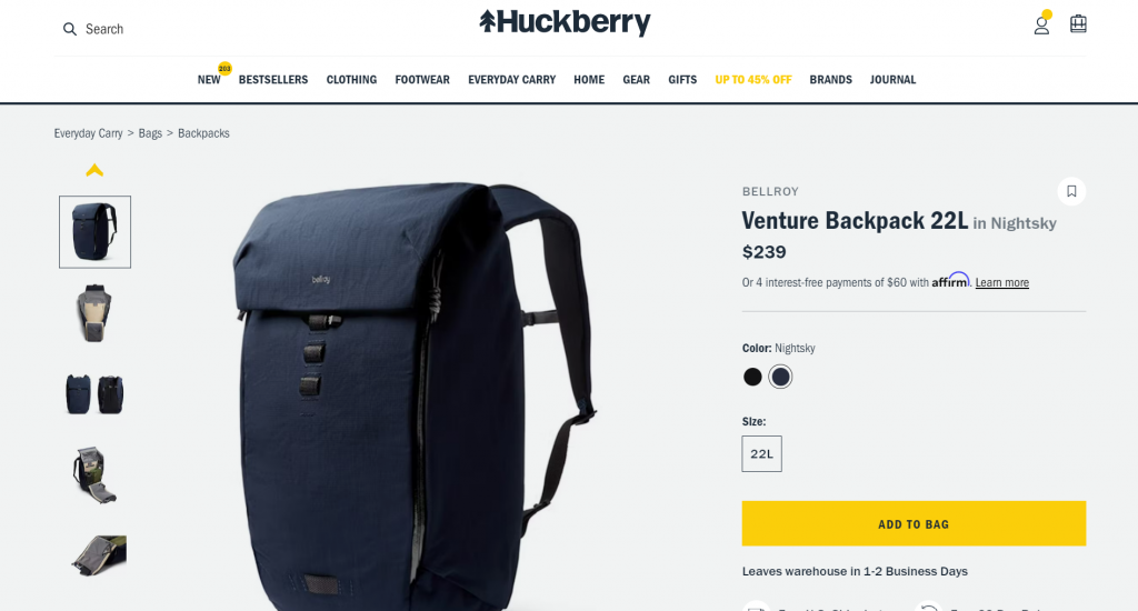
Notice that the main image is just the backpack, nothing else. The image has good lighting, so you get a great idea of the color. There are no shadows on the product itself (although there is a small shadow underneath to show dimension).
Most products lend themselves to a knockout feature image like this, but clothing can be an exception. Product pages for clothing often have a model wearing the product. Look at this Banana Republic’s chinos example:
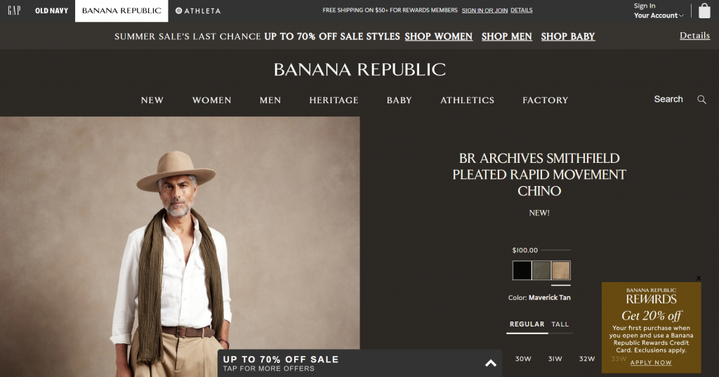
Clothing can look unappealing without context. Online stores that emphasize style may choose to have this sort of “lifestyle” image lead off their images — it’s selling the garment by saying “look how good this person looks. You can too.” Notice that the lighting is still good and the contrast is high. And even though this is the first image you see, Banana Republic includes supplemental images that conform more closely to regular product best practices.
Supplemental Images
If someone were in a brick and mortar store, they’d take something off the shelf, turn it around and look at it from different angles. They’d try it on or pretend to use it so they can get a sense of how it feels. These visual and tactile options aren’t there online, so multiple product photos matter. 75% of online shoppers say product pictures are “very influential” in deciding whether they want to buy. Over 60% say multiple camera angles are important.
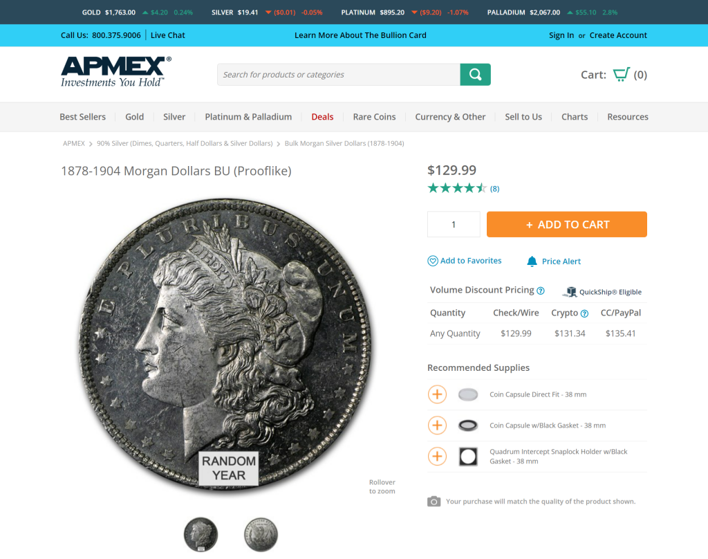
This is one of the simplest products you could buy: a coin. Even for this simple item, great photography of both front and back in high resolution help sell it.
Here are a few considerations for supplemental images:
- Create images with a similar style to the featured image, but different angles (front and back, side and quarter views) to capture the complete detail of the product.
- Include lifestyle images displaying the product in use. These may or may not have people. Paint a picture of your product in use so people envision themselves using it.
- Consider 360-degree photos. This is a niche option, but becoming more popular for items that customers may be used to touching.
Make sure you’re providing customers with as much visual information as possible so they can make an informed buying decision.
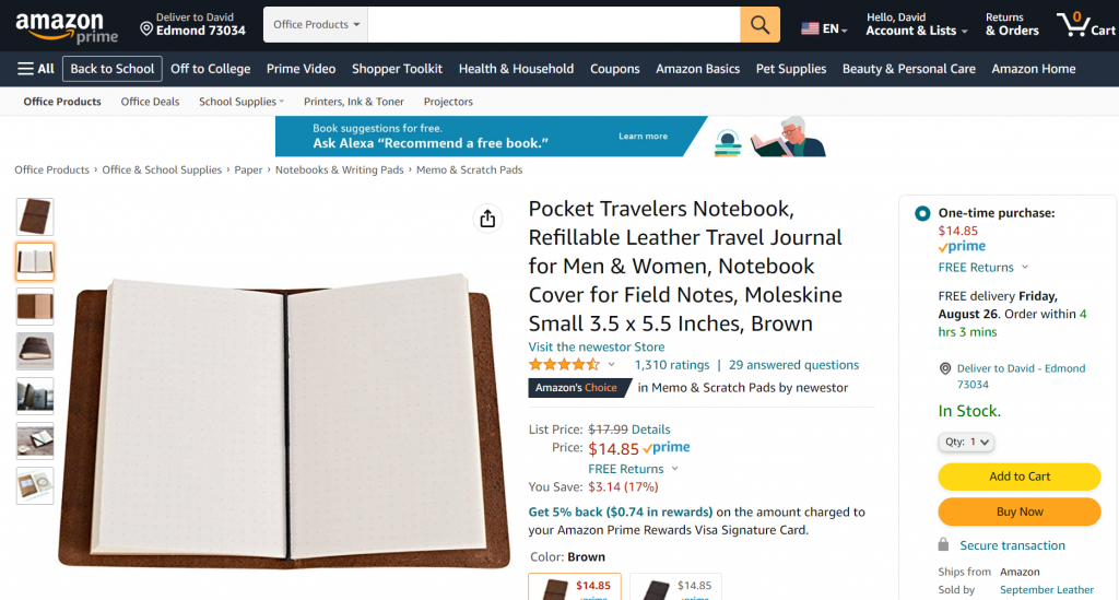
This Amazon product is a great example of supplemental image use. You have the product from multiple angles, a picture of the pages, and some lifestyle shots to show it in context.
Product Information
Product information is critical. A picture can tell your customers a lot, but they’re still not seeing the product in person. Details like material quality, weight or scale aren’t clear unless you provide that information.
Stick to the facts here. These are specifications, not selling. Include at least the following:
- The name of the product. Include model information, SKU or serial number.
- Pricing. May include bulk options.
- Dimensions. Weight, length, width, height, depth.
- Technical specifications. Does it have any compatibility issues?
- Materials. Type of materials, any extra identifying information that makes it stand out (e.g. full grain vs. bonded leather).
- Features. These will vary by product type; look at similar product listings to get an idea of what to include. Features are usually shown as bullet points by the product.
- Variations. Size, color and other differentiators. Most platforms will allow you to have one main product page for all variations that lets customers choose on the page.
- Supplemental documentation. Data sheets, product manuals, hazard information.
Put all the important product information above the fold if possible. Use your best judgment here; something like supplemental documentation may not be necessary for most people, so it may be OK to drop below the fold.
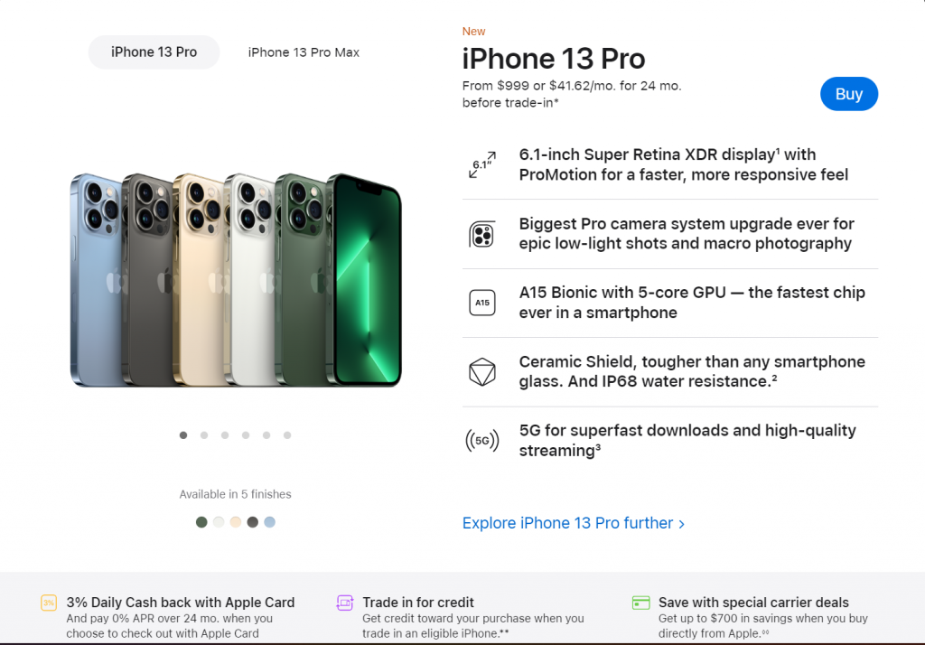
Apple’s iPhone 13 page is a great example of an effective product description. All the relevant information is clear so you can make an informed buying decision:
Product Description
Up to this point we’ve been talking strictly information. Now we get to selling.
The product description is the story of the product — the sizzle, not the steak.
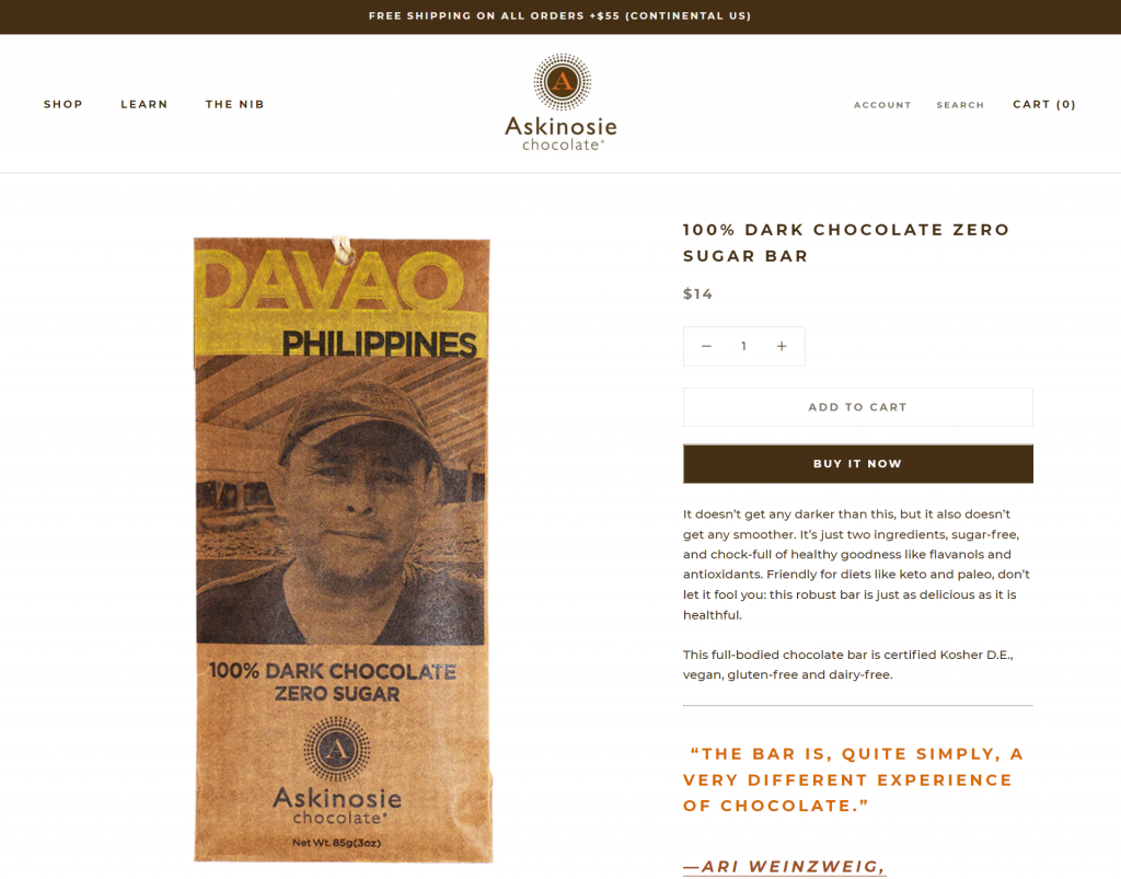
This is an excellent product description from Askinosie. Let’s take a look at how you can create your own sizzle.
- Focus on customer benefits first. Benefits are what your customer wants: convenience, lifestyle, cost, comfort, style, mobility … there are a ton of possible benefits (I love using this list to spark ideas). Nobody buys a product because it has an attribute. They buy it because it fills a need. Look at the Askinosie copy above. The company is dedicated to specific values: locally sourced ingredients, sustainability, social responsibility. Their audience cares about those things too, and they also tend to be health-conscious. Make sure your benefits are something your audience cares about.
- Show unique attributes of the product. A product’s attributes create its benefits. Askinosie’s benefits are lifestyle, health, sustainability. For their attributes they focus on the number of ingredients and nutrients and emphasize that it still tastes good — qualities that match those benefits.
- Use personal stories, testimonials and customer quotes. Anything you can do to make a product more personal to your audience will help. In this case, it’s anchored by a quote. As marketer Robert Cialdini wrote, “we view a behavior as more correct in a given situation to the degree that we see others performing it.” Marketers call that “social proof.” Use social proof to lower your audience’s guard.
- Include keywords. Proper keywords will help your page rank in Google, and they’ll also help you keep your description grounded and specific. The point of keywords (and the reason Google cares about them) is that people search for those words. Do some keyword research before you put together your product description to figure out what your audience wants. In Askinosie’s case, it’s obvious their audience for this chocolate bar is looking for health-related keywords like “flavanols,” “antioxidants,” and “keto.”
These four pieces must be part of your product page. But if you want to add more, there are a few extras that can improve the experience.
Product Page Enhancements
Reviews
Humans are herd creatures. We rely on other people to give us signals for our decisions, and that’s readily apparent when it comes to online shopping. 93% of online shoppers say they’ve been influenced by a product review on a shopping site. If you’re not soliciting reviews and using them on your product pages, you’re missing out.
Cross-Sell and Upsell
Cross-sell and upsell are critical pieces of any sales strategy, not just online. Think of cross-sell like when you get a burger and the person at the drive-thru says “Do you want fries with that?” or “Do you want to make that a meal?” An upsell would be “Do you want to add cheese and jalapeños?” Upsells increase revenue by 10-30% on average. Conversion rate goes up by 70% for recommended products. If you’re trying to increase your sales, these are essential tools. There are a number of ways to handle related products, including retailer, manufacturer and customer recommendations.
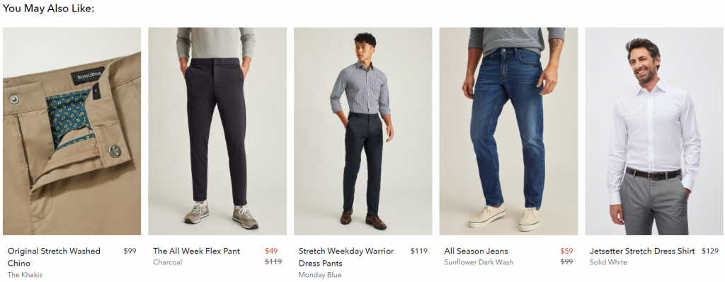
Consider a “related products” or “you may also like” box on your product page. Most eCommerce technology, like what you’ll find in Rainmaker Platform, will allow you to create linked products for cross-selling. Here’s an example from one of Bonobos’s listings for a pair of chinos:
Product Video
If a picture is worth a thousand words, how many is a video worth?
Video is a powerful online selling tool. People can’t try out a product themselves when they’re shopping online, so video lets them experience it vicariously.
Look at this example from Home Depot:
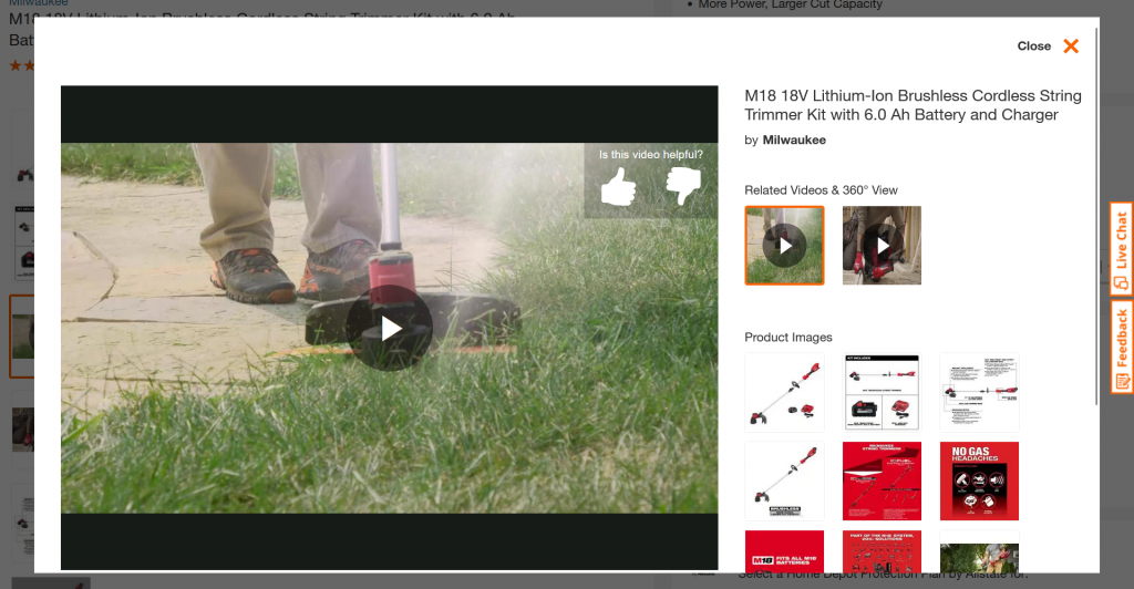
Seeing that string trimmer in action gives you a whole different understanding of its capability than just looking at the product images (bottom right).
Use Your Product Page to Sell
Online selling is here to stay, and even brick and mortar businesses need to hop on board. Whether you’re a seasoned online seller or trying to build your store for the first time, these are the keys to creating a product page that actually sells.
Need an online business platform to get started? Most platforms support all of these essentials and enhancements, but one of the easiest to use is our own Rainmaker Platform. Take a look and see if it matches your needs. And if you want to know more about setting up an online store, just drop us a line anytime.
Best Regards,
David Brandon
Copywriter
Rainmaker Digital Services