People don’t read the newspaper as much as they used to — but its legacy is still with us.
For a couple of centuries, the newspaper was the primary source of news. People read the paper with their morning coffee, digesting the day’s headlines along with their breakfast. And the top headlines, the ones you really needed to know about, were the first thing you saw when you picked up the paper — even before you opened it.
This is where the term “above the fold” was born.
Despite the fact that your device screen doesn’t fold up, “above the fold” still lives on in UX. It’s a term for what’s shown on a screen the moment you load into a web page — anything you don’t have to scroll to see.
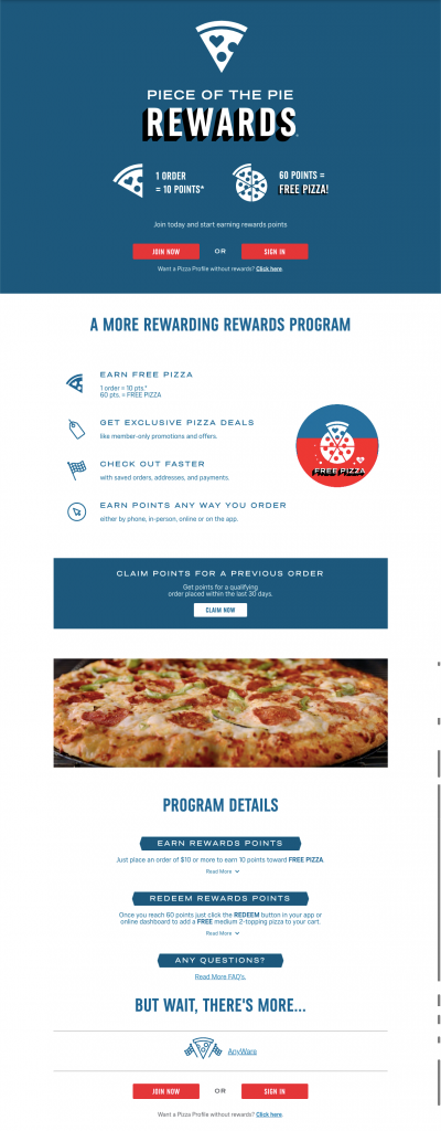
“Put the most important thing above the fold” is a hallowed design principle for a reason. Yet you run into landing pages that look like this all the time:
This page has a lot of important information as you scroll down; sure, the basics are at the top of the page, but there’s plenty more below the fold. What gives? Did Domino’s make a mistake? Can you put important information below the fold at all?
Yes, you can. Your challenge is to motivate your customers to go below the fold.
Does Above the Fold Still Matter?
It’s easy to not think about above vs. below the fold when you’re creating digital content. I know; I’ve done it myself. This is the copy I’ve spent long hours poring over. Surely people will want to read all of it.
Doesn’t work that way.
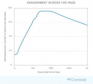
According to data from content intelligence platform Chartbeat, average maximum engagement comes just before the “fold” — at roughly 550 vertical pixels. After that the number of engaged users tends to drop off, and it can be dramatic.
One long, in-depth collaborative study run by Slate and Chartbeat found that only 25% of readers stay engaged in an article once they get to 1600 pixels of scroll depth. To put that in perspective, the laptop I’m typing this on has a natural resolution of 1920 x 1200. Bearing in mind a few pixels of my screen are reserved for taskbars at the top and bottom of the screen, that means most people are only scrolling about a page and a half — maybe two pages, depending on monitor resolution.
It’s even worse when you look at mobile. Chartbeat’s 2021 data shows that on average, users scroll 34% of the way down the page on desktop — but only 25% on mobile. And because of the smaller screen size on mobile devices, they’re seeing less of the page anyway.
So yes. Above the fold does matter. But this isn’t the whole story.
Getting Them to Go Below the Fold
You lose a lot of people once you get below the fold; that’s an indisputable fact.
But the flip side of that is that if you can get them to read below the fold, they tend to stick around.
Look at Chartbeat’s engagement chart:

You’ll notice that once you hit the high point of engagement, it doesn’t fall off immediately. That correlates with other studies too. The agency Sculpt Digital conducted a survey of over 20,000 sessions and discovered that when people scrolled to the halfway point of a page, 80% of them would scroll to the bottom.
To summarize: yes, you lose a lot of people above the fold. But if you can get them past the fold, they’re probably engaged enough to read to the end.
Above the fold matters. But the real opportunity is in the audience you get to go past the first screen. When you can keep people engaged, you can build community, create interest and sell in a way you can’t if they bounce right away.
You have to give them a REASON to scroll.
Creating a Reason to Scroll
How do you keep people engaged past the fold?
You’ve probably heard of the principle of reciprocity: offer somebody something they need and they’ll feel compelled to reciprocate. It’s a principle content marketing runs on — when you provide useful information, people are more likely to use or recommend your product or service.
You can use this to keep people engaged below the fold on your web pages. Summarize what people are interested in above the fold, then add detail below.
How you apply this principle will depend on the type of page you’re building.
- Landing page: Keep the value proposition front and center. Swipe File has a great catalog of sales pages you can look at for inspiration. Make sure your audience knows what you’re offering above the fold, then spell it out in greater detail below the fold. Give them CTAs about every page length (1000 pixels or so) to capture people before they have a chance to leave.
- Front page: Focus on how you can help your audience, don’t focus on yourself. Give a summary above the fold so they know what you’re about, then break it down into details as you go down the page with examples and benefits.
Decide which benefits are best for your audience and build pages based on them. And be aware of your product; if you’re offering something with a lot of brand recognition (Tesla, Coke) or with a low cost (T-shirts, hats), you probably won’t need a ton of copy. The more complicated or innovative your product or service, the more copy you’ll need, and the more important it is for you to get people below the fold.
Tips to Keep People Engaged Past the Fold
You know what you need to do to get people to scroll down. Now here are some tips to make sure they keep going.
Assume Two Screens of Engagement
Chartbeat’s data says most people will start scrolling down even before a page is fully loaded. You’ll lose some before the fold — that’s unavoidable. But once you get them past the fold, you can assume that you have two screens to get people hooked.
Put your most important information above the fold, and focus on the area around 550 pixels for your CTA or slogan. Then put the next most important information on the next screen.
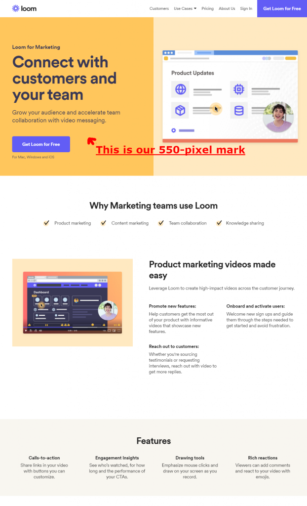
Take this “Loom for Marketing” landing page as an example. This is only part of a much bigger page, but I’ve grabbed the first 2000 pixels — roughly two to two and a half screens on the average desktop or laptop computer. I’ve also noted the 550-pixel mark where engagement tends to spike.
First, the most important information and a CTA are above the fold.
But as you scroll down, you get more critical information. That section about the product marketing videos is the primary benefit Loom wants you to take away from the page after the information at the top — it’s in that crucial first two screens.
To keep people engaged, put your next most important information just below the fold on the second screen. If you can keep people engaged there, they’re much more likely to read to the end of the page.
Keep Your CTA Accessible
If you have a page that sits completely above the fold, you can get away with one CTA. If you have a longer page, you can add CTAs after every section.
As we’ve covered, your audience will slowly drop off as you go down the page, and if you’re not putting CTAs in as they go, you’re missing out on traffic you could capture.
There are exceptions to this. Some products may require a fuller explanation — big-ticket or innovative items. In those cases you might just put a CTA on the first screen (to capture people who bounce before the scroll) and at the bottom (since you likely need to tell the whole product story to get them engaged).
Your goal is to keep people on a journey down the page, while also offering them convenient off-ramps to the action you want them to take. Make sure those off-ramps are in logical areas for the type of page and the product or service you’re selling.
Avoid the False Bottom
A “false bottom” is a design that creates the perception that the page content is finished.
Avoid these elements so you don’t create a false bottom:
- Strong color block lines: A sharp delineation between color blocks can create a false bottom. Make sure not to leave too much padding around your content when you have contrasting blocks, or the audience won’t have any visual cues to keep scrolling.
- Too big of a hero image: If your hero image is too big, particularly on a home page, your audience may interpret it as a splash page; they may leave without scrolling because they think that’s all the content there is. Be careful to leave space.
- Too much negative space: Padding matters. If you leave too much negative space, your audience might not know there’s more content as you scroll down the page. Make sure your content blocks aren’t over-padded. Test this with people outside your organization; see where they naturally stop scrolling when you ask them to review the page. This can help you find trouble spots.
- Ads or calls to action: Ads and calls to action are traditional endings to a page. That can be an issue, as many landing pages include calls to action throughout and many articles include ads. Make sure your ads and CTAs don’t take up too much space on the page so you don’t create a false bottom.
Embracing Both Sides of the Fold
Your job is to take your audience on a journey through your content. Grab attention with the headline, keep it with your above-the-fold content, then seal the deal with your below-the-fold content.
Above the fold still matters — but with the advent of the Internet, your audience is likely to engage with content further down. Offer them value and build your page so it encourages engagement below the fold too. And if you need a hand, just drop us a line, anytime.
Best Regards,
David Brandon
Copywriter
Rainmaker Digital Services

