The most valuable design lesson I ever learned came at a study party in college.
As I was wearing out my yellow highlighter on my history textbook, one of my friends walked past the spot where I was sprawled on the carpet and stopped me. “You’re highlighting too much,” he said. “If everything is important, nothing is.”
I’ve never forgotten that. Sometimes less is more.
If everything is highlighted, nothing is. You need to highlight only the things that matter, and nowhere does that matter more than on your website.
Novice web designers usually try to add too much content. They’re afraid to leave open areas, what we would call negative space. But negative space is vital to great design. Negative space isn’t wasted space — it’s part of the design, and it creates priority and focus in your content.
With proper use of the space between your visual elements, you can emphasize what you want your customer to see. You can take them on a journey; they’ll click on the links you want them to click on and read what you want them to read. Here’s your primer on how to effectively use negative space.
How to Use Negative Space
When you design your pages, space allows your elements to breathe. It gives the eye breaks in the page — breathing room.
Have you ever met someone who doesn’t pause when they talk? A site that doesn’t use negative space feels like that guy. There’s no way to tell what’s important. Don’t think of negative space as something that’s outside of your design. It’s an integral part — it lets you communicate the importance of the content.
Producing a website is as easy now as it’s ever been. Drag-and-drop/WYSIWYG editing, themes and other ease-of-use changes, and advancements in CSS and Javascript let you make a lot of changes to a site quickly. It can be tempting to go wild.
Don’t.
The most important content consideration is to be intentional. Negative space for the sake of negative space is as bad as color for the sake of color. Everything you place on a page should have a reason to be there.
Here’s how to get started.
Space Your Text Out
Format your text to make important details noticeable.
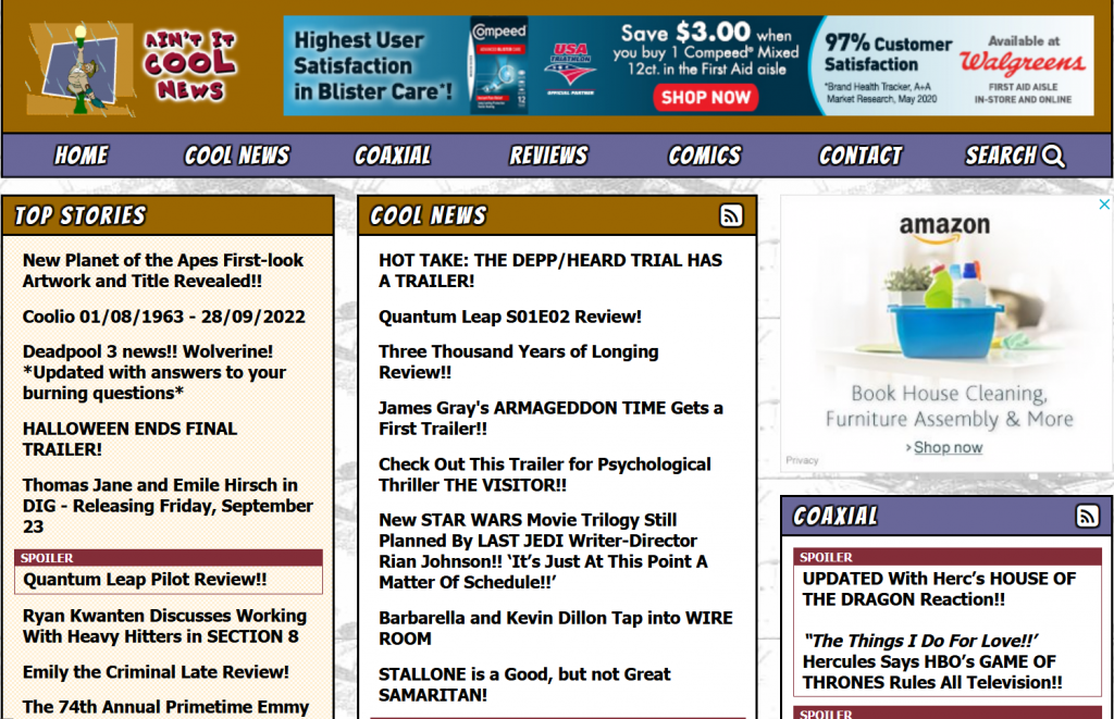
This is an example of not using your text effectively. Everything is too close together, and the bold, black text wears out your eyes quickly.
Even a very text-heavy page benefits from spacing. Look at Craigslist — it’s not pretty, but it’s simple to navigate:
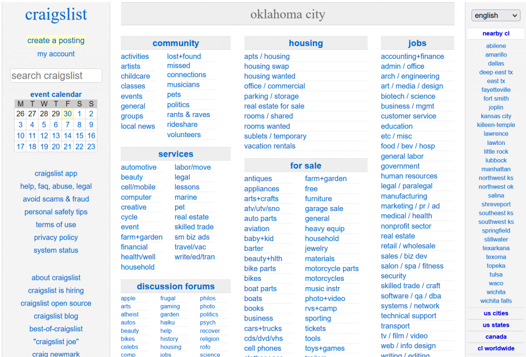
Here are a few basics on how to use space effectively around your text:
- Don’t overuse bold text or all caps. Bold and all caps are great for adding emphasis, but too much of either make the page look less spaced. The text is more crowded because of the added width.
- Use spacers where appropriate. Notice Craigslist above — there are very light lines between each text box, which helps keep your eye moving and creates a hierarchy. Spacers can make white space feel intentional instead of haphazard.
- Break up paragraphs. For longer pieces, two to three sentences is usually a good paragraph length. I’ve seen many posts on my LinkedIn, Twitter and Facebook feeds that only use one sentence per line. Personally, I hate it (it feels contrived), but it’s a good way to keep people reading.
Unclutter Your Pages
Text isn’t the only thing that can make a page hard to read. Too much clutter (like the Ain’t It Cool News example up above) can be an issue too.
If you were around in the early days of the web, you know exactly what I’m talking about. Remember pulling up a web page with a thousand flashing ads and way too many pictures? I do. (Thanks to Cameron Askins at Cameron’s World for this brilliant piece of Internet nostalgia.)
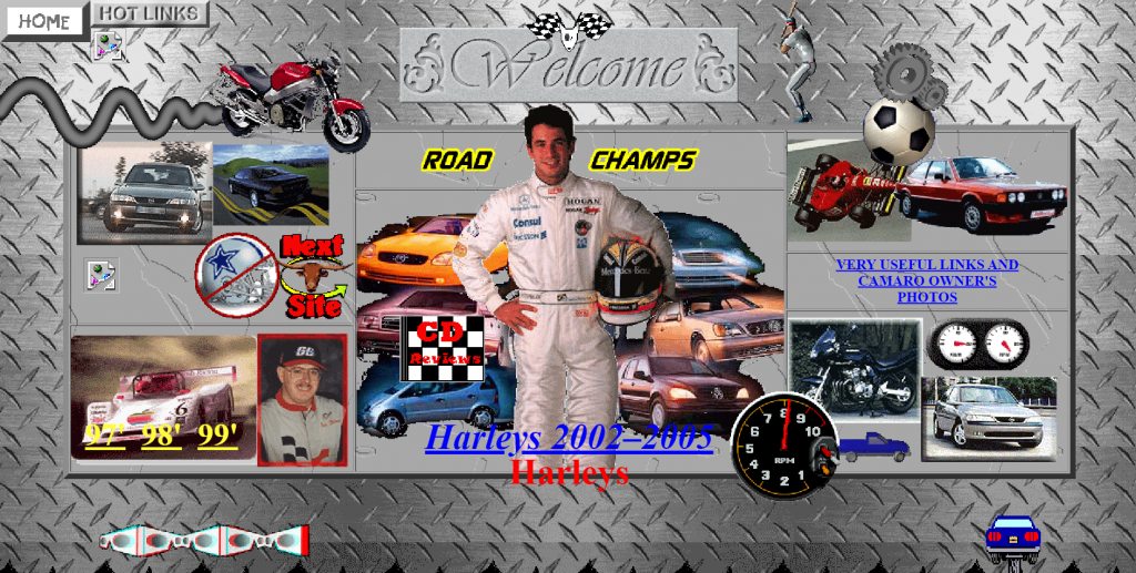
It’s a lot harder to find an example of that kind of clutter today; themes and templates have curtailed the worst impulses of amateur designers. But if you mess with your theme too much, you can still do it.
Here’s how to keep pages uncluttered:
- Have a clear hierarchy in mind. Decide how important you want everything on your page to be. The most important thing (usually the hero image or headline) is the biggest and usually has the most negative space around it. Then as elements become less important, they become smaller. If you can’t tell what’s most important and least important on your page, neither can your audience.
- Leave the fancy stuff out. You could add a bunch of rollover buttons, fancy colored menus and more — it’s not hard anymore. Don’t fall to that temptation. One or two elements are enough; save them for when they really matter.
- Use background images sparingly. Background images can add interest to a page, but they’re best used carefully. Your design won’t work if the details of the image clash or distract from the other elements on the page. Stick to solid colors most of the time, and if you use an image, make sure it’s not busy. If you need to tone down a background image that stands out too much, try using a transparency to make it blend in more. Make sure the user’s eye goes where you want it to go.
Use Eye-Guiding Elements
When you look at a web page, you’ll notice that there are subtle elements like lines and color blocks that guide your eye. This is an intentional design choice — and it’s based on the way your eye takes in information.
Most of the time, people use an F-pattern to scan a page: the elements at the top of the page (headline/header image), the middle of the page (the meat of the content), and the left side (where your header/navigation elements tend to show up). There are other patterns too, including Z-pattern and layer cake, but you can generally rely on the F. Look at Statista’s front page:

Lines, color blocks and borders all play into guiding the eye.
Here are some basic eye-guiding elements you can use:
- Rule lines. Not every element needs rule lines — look at the example above. There’s no need to put a rule line in between the headline and the subhead. Use rule lines in places where it would be difficult to delineate between elements, like the Craigslist front page we mentioned above.
- Color blocks. Color blocks can help you emphasize elements too. Look at “Prices & Access” on the Statista page above, or the words under the search box.
- Borders. A border can be useful too, especially for an element you want to emphasize. These are best used in moderation; like our too-bold text example above shows, a page can feel claustrophobic if every element is surrounded by a border.
Get Design Help
Your website design needs to do one thing: make your message clear. A good designer can balance the content and other visual elements with the negative space on the page. If you hit that right balance, your design will enhance your message, not take away from it.
I’ve been around good design and good designers enough to know a little. But mostly I just know what looks bad. People in general are pretty good at diagnosing that there is a problem, but bad at explaining what it is. That’s why specialized training exists.
If you’re not willing to spring for a designer, go for the next best thing: stick closely to themes and templates that have already been created. A professional designer has already looked at them and determined which fonts, colors and spacing works best together, and a platform like Rainmaker Platform will have quality themes you can set up yourself.
Negative space is a powerful element in your web design, and a professional will use it to emphasize your message. If you need a hand, reach out to us here at Rainmaker Digital services. We’re here to help — just drop us a line, anytime.
Best Regards,
David Brandon
Copywriter
Rainmaker Digital Services