Sir Isaac Newton’s first law of motion doesn’t just apply to objects. It applies to people, too.
“Every body perseveres in its state of rest, or of uniform motion in a right line,” stated Newton, “unless it is compelled to change that state by forces impressed thereon.”
In other words, inertia. Objects resist movement. So do people.
A landing page is used to break inertia. It’s the tool you need to stir people to do something, whether it be signing up for a newsletter, buying a product or downloading a white paper. There are three essential components, the “ABCs,” you need for an effective landing page.
Components of a Landing Page
The ABCs of landing pages are:
- Action
- Benefit
- Clarity
Action
Most articles about landing pages would probably put the action last. That’s a mistake. Before you even start writing, you need to know what you want your audience to do. What action are you trying to get them to take?
The most common actions are:
- Download. An app, a whitepaper, a report. It’s easy to put email capture here too for a double benefit.
- Sign up. A newsletter, a subscription. Email or phone number capture lets you move people down the sales funnel or serve them content they’re interested in.
- Purchase. This is very common, and most commonly used for a special offer or something out of the ordinary.
It can be easy to want to include multiple actions. Don’t. A landing page has to be built with one specific action. It’s tough enough to break inertia. Don’t complicate it.
In the same vein, make the action as simple as possible. Your call to action (CTA) must state what you want your audience to do. Use a strong action verb like:
- Download
- Subscribe
- Buy
- Shop
- Order
- Learn
- Click
Write your CTA first and make sure it’s clear to YOU. It won’t be clear to anyone else if it’s not clear to you first.
Start with the action you want your audience to take. That’s the first key to an effective landing page. Everything else builds on the action.
Benefit
You’ve figured out what you want your landing page to accomplish. Now you need to figure out how to make people care.
Your audience won’t take action for no reason. They need to understand the benefit for them.
Adman Howard Gossage once said, “Nobody reads ads. People read what interests them, and sometimes it’s an ad.” Get them interested.
Take your action and look at it from your audience’s perspective. You need to offer an opportunity or solve a problem.
Opportunity
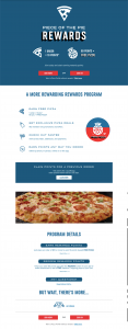
Take a look at this excerpt from a Domino’s Pizza landing page.
There are four benefits laid out here: “Earn Free Pizza,” “Get Exclusive Pizza Deals,” “Check Out Faster” and “Earn Points Any Way You Order.”
The action the company wants you to take is clear — “Claim Now,” which signs you up for the loyalty program — but the reason to claim is clear to the audience. They understand the deal, and the benefits are strong enough for them to want to sign up.
Problem
The Oxi-Clean infomercials — the ones where Billy Mays shows all the types of stains you can clean off your dirty clothes with Oxi-Clean are amazing marketing. They draw in the audience, explain the problem and give us the solution with powerful visuals. These infomercials are the television equivalents of a landing page. “Look how your life can get better… order now.”
Depending on your market segment, problem-solving landing pages can be highly effective. Look at this Hale Fitness landing page as an example.
This page lays out the issues with traditional gym programs, then goes down the list point by point and explains what Hale does to fix them. The benefit is immediately apparent — and it leads straight into the CTA.
That opportunity or that problem is what you have to focus on.
Be careful, too. Make sure the benefit you articulate is an actual benefit. Most benefits are emotional. Coke doesn’t sell brown sugar water — they sell memory, tradition, belonging (this is one of the things New Coke missed). Supreme sells exclusivity. Jeep sells adventure. You get the picture.
Have your action clearly in mind, then explain the true benefit that action brings.
Clarity
One of the easiest mistakes to make is overcomplicating your landing page. Keep your action simple and your benefits focused, or you’ll lose your audience halfway down the page before you even get to the CTA.
Here are a few tips on clarity:
- Put your most important information above the fold. This is even more critical than it used to be with mobile browsing becoming common.. Make sure the most important information and a CTA sits above the fold on every device. That may mean multiple CTAs on the page — that’s fine.
- Leave navigation off the page. No menus. No sidebars. The more distractions you add, the more likely it is people leave before they take the action you want them to take.
- Keep your copy short. Every word matters. If it doesn’t serve the action or the benefits, leave it out.
- Ask for only the information you need. The more information you ask for, the more likely you are to turn away your audience. You can ask for more when they get further down the funnel, if it comes to that. Don’t lose people by asking for too much at one time.
A landing page is your “elevator pitch.” It needs to be completely clear — what action do you want the audience to take and what are the benefits to them of acting. Keep it simple.
ABC, Easy as 123
Action. Benefit. Clarity. Those are the three ingredients that make a landing page work. Use them effectively and your landing pages will get the results. And if you need a hand getting started, we can help — contact us today for all your marketing needs.
Best Regards,
David Brandon
Copywriter
Rainmaker Digital Services

